
PNG vs. JPEG vs. WebP: Which Image Format Is Best for Text and Photos?
PNG vs. JPEG vs. WebP: Which Image Format Is Best for Text and Photos?
Because JPEG divides images into 8×8 pixel blocks and approximates them with smooth cosine waves (DCT), sharp typography creates 'mosquito noise' ringing halos and bloated files—whereas lossless PNG and WebP collapse flat UI backgrounds with zero blur.
Export an analytics chart, a software screenshot, or a social media quote card as a `.jpg` file to "save space," upload it to your website or LinkedIn feed, and look closely at the letters: every crisp black character is surrounded by a dirty gray halo of speckled pixels, and solid colored buttons look blotchy. Even more surprisingly, if you compare that blurry `.jpg` file (`215 KB`) against a crystal-clear lossless `.png` export (`142 KB`) or `.webp` export (`105 KB`) of the exact same graphic, the JPEG is actually 50% to 100% larger in file size.
Why does JPEG—the undisputed workhorse of digital photography—fail so badly on text, screenshots, and UI graphics, while PNG balloons to over `1,100 KB` when you save a camera photograph? The answer lies in the mathematical difference between frequency-domain cosine waves (`DCT`) and spatial dictionary run-length coding (`LZ77`).
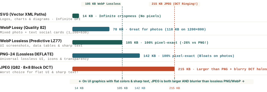
Why JPEG Blurs Text and Bloats on Flat Colors: 8×8 DCT & Gibbs Ringing
Designed by the Joint Photographic Experts Group in 1992 for continuous-tone camera photographs, JPEG compresses images through three lossy steps that are ideal for sunsets and portraits but destructive for typography:
- `4:2:0` Chroma Subsampling: Because human eyes are more sensitive to brightness (luminance) than color detail (chrominance), JPEG typically discards 75% of the color resolution (averaging color across `2×2` pixel blocks). On small colored text or thin UI lines, this immediately bleeds color across adjacent pixels.
- The `8×8` Discrete Cosine Transform (`DCT`): JPEG slices the image into tiny `8×8` pixel tiles and represents each tile as a sum of 64 smooth cosine wave frequencies, then discards high-frequency waves via quantization.
- Gibbs Phenomenon ("Mosquito Noise"): A real-world photograph rarely jumps from pure white to pure black in a single pixel, so smooth cosine waves approximate it effortlessly. A crisp letter or UI border, however, is a mathematical step function. When you try to reconstruct a sharp step edge using truncated cosine waves, the waves overshoot and oscillate on both sides of the edge—creating visible Gibbs ringing halos ("mosquito noise") and forcing the encoder to spend extra bytes encoding all 64 frequency coefficients inside every text tile.
JPEG tries to draw razor-sharp letters using smooth ocean waves; PNG and lossless WebP simply count how many identical background pixels sit in a row.
Why PNG and WebP Win on UI Graphics (and How to Choose)
Instead of converting pixels into cosine waves, PNG (`DEFLATE = LZ77 + Huffman`) and WebP Lossless scan pixels spatially. When an editorial chart or UI screenshot has 400 identical `#f9f7f1` background pixels in a row between two crisp `#161514` letters, `LZ77` dictionary compression collapses that entire horizontal run into a few bytes with 100% lossless pixel accuracy.
- Use `WebP Lossless` or `PNG-24` for Text, Screenshots & Carousels: According to Google's official WebP Compression Study, WebP Lossless uses spatial neighborhood prediction and green-channel subtraction (`subtract green transform`) to produce files 26% smaller than PNG (`105 KB` vs. `142 KB`) with zero generation loss and full 8-bit alpha transparency. When uploading to social platforms that require legacy raster formats, export at 2× retina resolution in PNG-24 so the platform's internal transcoder receives clean edges.
- Use `WebP Lossy (Q80–85)` or `JPEG` for Camera Photographs: On noisy camera photos where no two adjacent pixels are identical, PNG cannot find repeating pixel runs and balloons to `1,180 KB`. Lossy WebP (`118 KB`, 25%–34% smaller than JPEG) and JPEG (`172 KB`) excel here.
- Use `SVG` for Vector Logos, Icons & Data Charts: Whenever an asset is generated from geometric paths and text rather than camera pixels, SVG (`14 KB`) delivers infinite resolution at a tenth of the file size.
When exporting high-craft social documentation, quote cards, or technical walkthroughs, you can Plan multi-slide carousels in BatchPad with crisp typography and deterministic slide dimensions.