
What Climate Stripes Actually Show You
Climate stripes show one year per vertical band, coloured by how warm or cool that year was relative to a stated baseline. They are a compact way to show a long temperature record. They do not show a forecast, a daily temperature range or the cause of a particular heatwave.
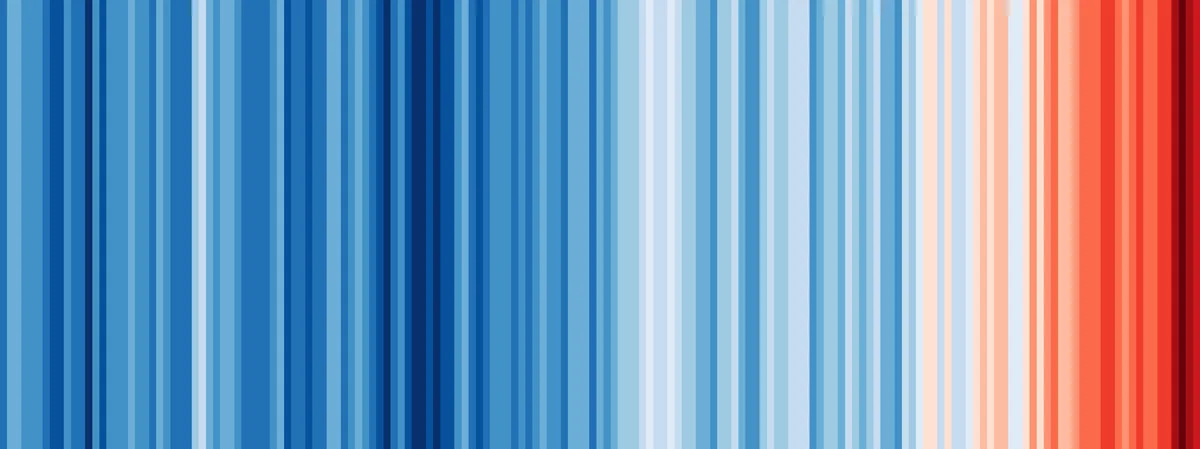
Each stripe is an anomaly, not an absolute temperature
Blue does not mean a cold winter, and red does not mean a hot summer. A stripe describes the annual average relative to its own baseline. The University of Reading’s original global graphic uses the 1961 to 2010 average. A city graphic can use a different baseline, so compare two stripe charts only after checking their source and reference period.
- Blue: a year below the chart’s baseline.
- Neutral: a year close to the baseline.
- Red: a year above the baseline.
Read a colour as a difference from the baseline
In a hypothetical example, an annual mean of 14.4°C against a baseline mean of 13.8°C produces an anomaly of +0.6°C. The stripe represents that difference. It does not mean the year was 0.6°C in absolute terms, nor that every season was warmer by the same amount.
Check the colour scale as well as the baseline. Two charts can assign the same red to different anomaly values. Without matched scales, darker red in one city does not prove it warmed more than another city.
What a local chart can and cannot show
Local stripes can reveal whether recent years tend to sit above or below a location’s historical baseline. They do not show why the pattern occurred, how much rain fell, or what an individual neighbourhood felt like. Station location, record length, data processing and baseline selection all affect a local chart. Read those details before treating a colour pattern as a precise city-wide measurement.
Use stripes with the numbers behind them
Read the stripe chart with the annual temperature series, the baseline period and the station or area represented. For a practical decision, compare monthly highs and lows, precipitation and the number of hot days. Those measures answer questions about a trip or move more directly than colour alone.
Sources and method
The warming-stripes graphic above is credited in its caption. Professor Ed Hawkins created climate stripes at the University of Reading in 2018; the university explains that each original global stripe represents one year relative to the 1961 to 2010 average. For U.S. station and normal data, use NOAA’s Climate Data Online and 1991 to 2020 Climate Normals datasets.
- University of Reading: Climate Stripes
- NOAA National Centers for Environmental Information: U.S. Climate Normals
- NOAA Climate Data Online
Eranorms lets you explore weather history beside a current observation. For the baseline behind a stripe chart, read what climate normals mean. For the practical side of a comparison, see record heat versus a typical summer and average rainfall by month.