
What Is Chroma Subsampling (4:4:4 vs. 4:2:2 vs. 4:2:0) and Why Does Red Text Look Blurry?
Every graphic designer and social media creator has hit this maddening export wall: you design a crisp multi-slide carousel or infographic with bright red, magenta, or electric-blue typography set against a dark charcoal background. Inside Figma or Photoshop, every letter edge looks razor-sharp. Yet the moment you export a standard web JPEG or upload an MP4 video reel, the white text stays sharp while the red and blue text turns fuzzy, blocky, and smeared—as if only the colored words were rendered at half resolution.
Your eyes are not playing tricks on you: the colored letters literally were saved at half horizontal and half vertical resolution. The culprit isn't DCT block compression alone—it is chroma subsampling (specifically the 4:2:0 sampling scheme used by default in web JPEGs, H.264/HEVC video, and social media encoders). Here is how the J:a:b ratio (4:4:4 vs. 4:2:2 vs. 4:2:0) actually works, why 1950s television engineers invented it, and how to stop it from ruining colored text on your slides.
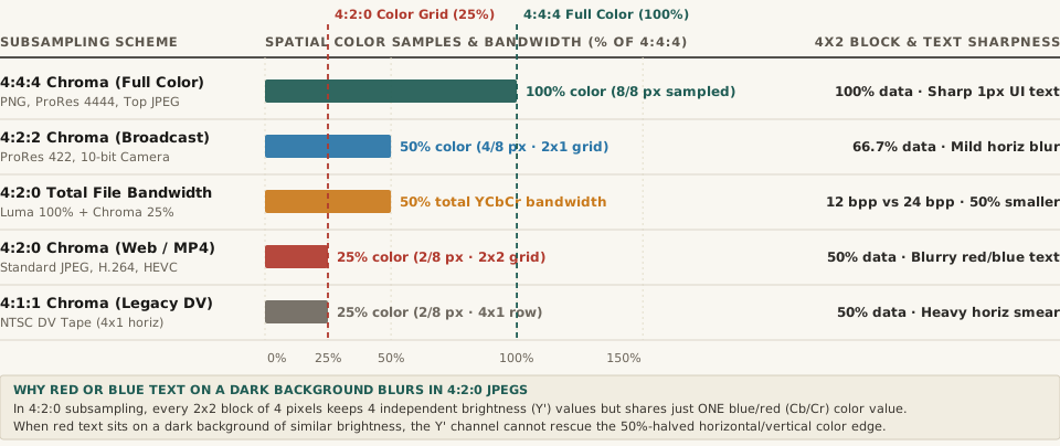
Y'CbCr data bandwidth across 4:4:4, 4:2:2, 4:2:0, and 4:1:1 subsampling schemes. Download the full dataset: chroma-subsampling-444-vs-422-vs-420-color-bandwidth-and-text-sharpness.csv.1. Why Y'CbCr Separates Brightness From Color: Rod vs. Cone Biology
When you work on a canvas in Figma, Photoshop, or CSS, colors are stored in RGB: every pixel carries three equal 8-bit channels (Red, Green, and Blue, totaling 24 bits per pixel). However, the human retina does not perceive spatial detail equally across brightness and color. The human eye packs roughly 120 million rod photoreceptors (which detect luminance/brightness contrast) compared to only 6 to 7 million cone photoreceptors (which detect red, green, and blue wavelengths), and our visual cortex resolves fine edges almost entirely from luminance contrast rather than hue changes.
Beginning in the 1950s with RCA and NTSC color television (and formalized for digital imaging in Y'CbCr color spaces such as ITU-R BT.601 and BT.709), compression engineers exploited this biological asymmetry by converting R'G'B' pixels into three new components before compression:
- Y' (Luma): The weighted brightness of every pixel (Y' = 0.299R' + 0.587G' + 0.114B' in BT.601, or 0.2126R' + 0.7152G' + 0.0722B' in BT.709), always kept at 100% full spatial resolution.
- Cb (Blue-Difference Chroma): How far the pixel's color shifts toward blue versus yellow relative to its luma.
- Cr (Red-Difference Chroma): How far the pixel's color shifts toward red versus cyan/green relative to its luma.
Once brightness (Y') is separated from color (Cb and Cr), encoders throw away half or three-quarters of the Cb/Cr color grid—a process called chroma subsampling.
2. Decoding the J:a:b Ratio: 4:4:4 vs. 4:2:2 vs. 4:2:0
As detailed in both Wikipedia's technical specification and RTINGS' display engineering testing, chroma subsampling ratios are written as a three-number code J:a:b describing a conceptual reference block that is J pixels wide (almost always 4) by 2 pixels tall (8 pixels total):
- J (First Number = 4): The width of the reference block (4 pixels wide × 2 rows tall = 8 luma pixels).
- a (Second Number): How many chroma (
Cb/Cr) samples are taken across the top row of 4 pixels. - b (Third Number): How many independent chroma samples are taken across the bottom row of 4 pixels (either matching
aor set to0when the bottom row simply reuses the top row's color).
Here is how each scheme impacts spatial color resolution, total file bandwidth, and 1-pixel UI typography:
| Chroma Subsampling Scheme (J:a:b) | Chroma Samples per 4×2 Block | Horizontal × Vertical Color Resolution | Chroma Data Retained (%) | Total YCbCr Bandwidth vs. 4:4:4 (%) | 1-Pixel Colored Text & UI Sharpness | Standard Codec & Platform Usage |
|---|---|---|---|---|---|---|
| 4:4:4 (No Subsampling) | 8 of 8 pixels (4 top, 4 bottom) | 100% horiz × 100% vert | 100% | 100.0% (24 bits/px) | Razor-sharp 1px red/blue text & icons | PNG, ProRes 4444, PC HDMI 4:4:4, Photoshop JPEG Quality ≥7 (54%+) |
| 4:2:2 (2×1 Horizontal) | 4 of 8 pixels (2 top, 2 bottom) | 50% horiz × 100% vert | 50% | 66.7% (16 bits/px) | Mild horizontal fringing on 1px vertical lines | Broadcast SDI (v210), ProRes 422, 10-bit mirrorless video |
| 4:2:0 (2×2 Grid Sharing) | 2 of 8 pixels (2 top, 0 bottom) | 50% horiz × 50% vert | 25% | 50.0% (12 bits/px) | Severe blur & bleeding on thin red/blue text | Standard Web JPEG, H.264/MP4, HEVC, AV1, social media feeds |
| 4:1:1 (4×1 Horizontal) | 2 of 8 pixels (1 top, 1 bottom) | 25% horiz × 100% vert | 25% | 50.0% (12 bits/px) | Heavy horizontal color smear across vertical strokes | Legacy NTSC DV camcorders and early digital tape |
“In 4:2:0 chroma subsampling, every 2×2 square of four pixels keeps four sharp brightness values, but all four pixels are forced to share a single averaged color value—cutting spatial color resolution to 25% and slashing total YCbCr bandwidth by 50%.”
3. Why Red and Blue Text Suffers Most—and How to Fix It
In natural landscape or portrait photography, discarding 75% of the color grid in 4:2:0 is nearly invisible because real-world objects have soft color transitions and strong luminance edges. Why does 4:2:0 destroy colored typography and UI screenshots?
- Red and Blue Carry Low Luma Weight: Look back at the BT.709 luma equation: green contributes 71.52% of perceived brightness (
Y'), while red contributes only 21.26% and blue contributes just 7.22%. When you place pure red text (#FF0000, luma ~21%) or pure blue text (#0044FF) on a dark charcoal card (#222222, luma ~13%), there is almost zero brightness contrast in the Y' channel. The entire letter edge is carried by theCrandCbchroma channels—which4:2:0just downsampled to a coarse 2×2 pixel grid! - Odd-Pixel Alignment Smears 1-Pixel Strokes: When a 1-pixel or 2-pixel serif or sans-serif stem straddles the boundary between two
2×2chroma blocks, the encoder averages the bright red letter pixel with three dark background pixels, turning a crisp red stroke into a muddy 4-pixel-wide pink/brown halo. - How to Prevent 4:2:0 Blur in Carousel Exports: When exporting slides for platforms that accept PNG or high-bitrate JPEG, export as PNG-24 or force 4:4:4 JPEG subsampling (in Adobe Photoshop's Save As JPEG dialog, setting Quality to 7 or higher [54%–100%] automatically switches from
4:2:0to4:4:4; in command-linecjpegor ImageMagick, pass-sampling-factor 1x1,1x1,1x1). And if a social platform forcibly re-encodes your upload into4:2:0JPEG or H.264 MP4, ensure at least a 40% luminance (Y') contrast gap between colored text and its background (for example, using pastel coral or cyan on a near-black#0D0D0Dbackground, or adding a crisp dark drop-shadow) so the full-resolutionY'channel carries the letter edge.
Design High-Contrast, Compression-Proof Carousels in BatchPad
Whether you are building multi-slide technical explainers, code-snippet carousels, or product comparison decks, checking how your typography and color contrast hold up across platform compression keeps every slide crisp. Plan multi-slide carousels in BatchPad to lay out seamless multi-panel graphics with clean typographic hierarchy and export-ready dimensions.