
What Is the Difference Between sRGB, Display P3, and Adobe RGB, and Why Do Wide-Gamut Photos Look Washed Out on the Web?
Every photographer has experienced the export shock at least once: you spend an hour grading a sunset portrait or vibrant foliage frame in Lightroom or Capture One, export a JPEG for a client gallery or social feed, and the moment you open the uploaded image in a browser or messaging app, the glowing oranges turn muddy peach and the emerald greens look pale and lifeless.
The culprit is almost never your monitor calibration—it is a mismatch between the color space triangle in which your pixel numbers were encoded and the color space assumed by the viewing app. By comparing the standardized CIE 1931 chromaticity coordinates of sRGB, Display P3 (DCI-P3), and Adobe RGB (1998) across RGB color spaces, you can pick the exact right container for editing, printing, and web delivery. When framing and exporting multi-image sets for social carousels or print portfolios, you can Batch-pad and frame high-DPI print canvases in BatchPad with clean color-managed output.
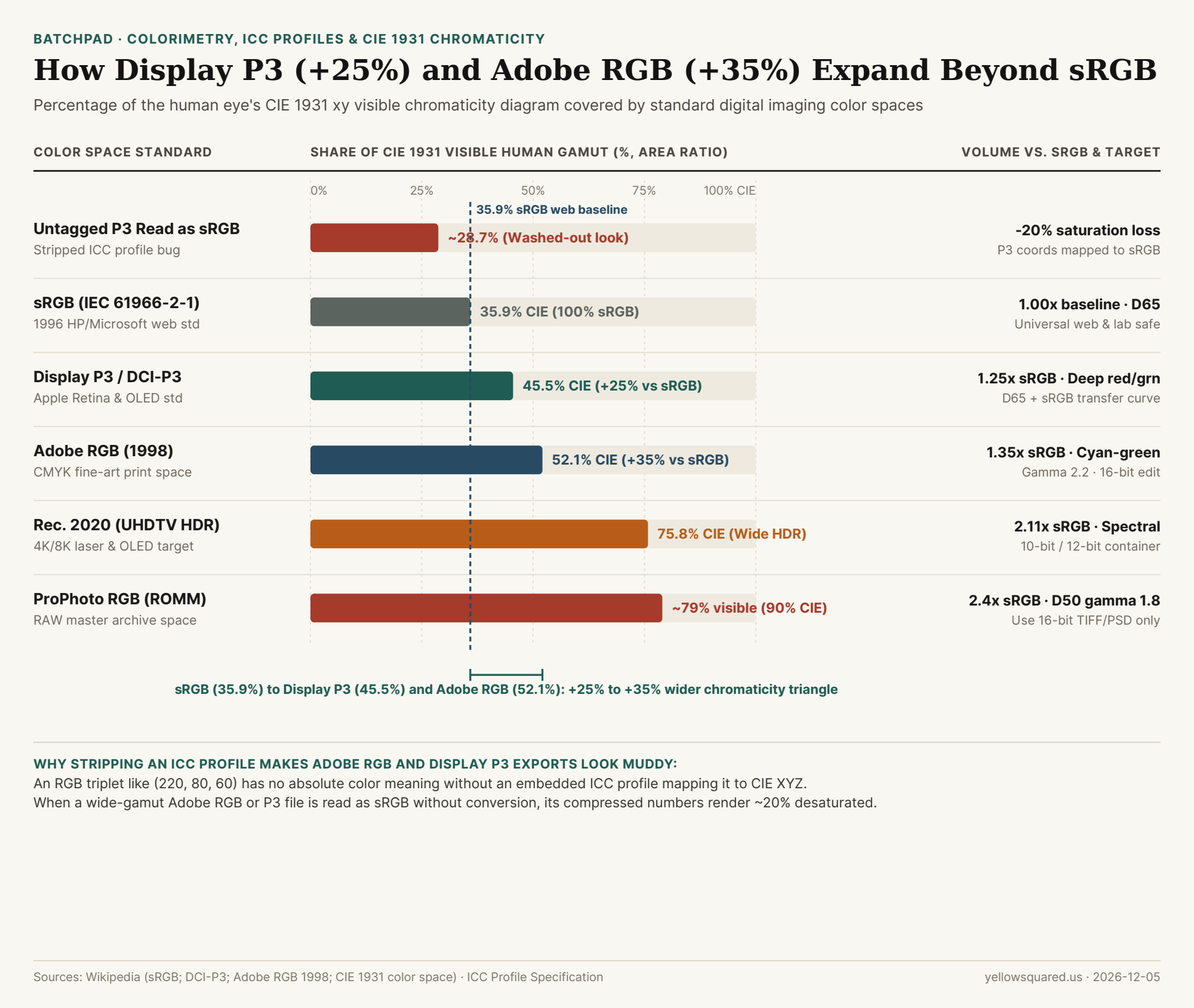
How sRGB (35.9%), Display P3 (45.5%), and Adobe RGB (52.1%) Divide the Visible Spectrum
In 1931, the International Commission on Illumination (CIE) mapped every color visible to the human eye onto a horseshoe-shaped xy chromaticity diagram. Any additive RGB color space defines three primary anchor points—Red (x_R, y_R), Green (x_G, y_G), and Blue (x_B, y_B)—forming a triangle inside that horseshoe. A display or file can only represent colors that fall inside its triangle:
- sRGB (
IEC 61966-2-1, 1996 —35.9%of CIE 1931): Co-developed by Hewlett-Packard and Microsoft in 1996 to match the phosphor limits of 1990s CRT monitors (Rec. 709primaries with aD65 / 6500Kwhite point and a~2.2piecewise transfer curve). While sRGB covers only35.9%of the CIE 1931 diagram, it remains the universal default of the World Wide Web, Android/Windows UI layers, and commercial mini-lab photo printers (such as Fujifilm Frontier and Noritsu wet labs). - Display P3 (2010–2015 —
45.5%of CIE 1931,+25%Larger Than sRGB): Created by Apple by combining the theatrical DCI-P3 wide-gamut primaries with a standardD65(6500K) white point and the familiar sRGB transfer function (gamma curve). Display P3 covers45.5%of CIE 1931—giving you a25%larger color gamut volume than sRGB, concentrated heavily in deep crimson reds, neon oranges, and vibrant spring greens on modern iPhones, iPads, Macs, and OLED screens. - Adobe RGB (1998) (
52.1%of CIE 1931,+35%Larger Than sRGB): Engineered by Adobe in 1998 to encompass the cyan-green ink gamut of commercial CMYK offset presses and 10-ink fine-art pigment printers. Notice that Adobe RGB and Display P3 use the exact same Blue primary (x=0.15, y=0.06), but push in different directions: Adobe RGB reaches much further into cyan-greens (y_G = 0.71vs.0.69in P3), whereas Display P3 reaches further into saturated red-oranges (x_R = 0.68vs.0.64in Adobe RGB). - ProPhoto RGB (
ROMM RGB—~79%Visible /90%CIE 1931): Used internally by Adobe Lightroom's Develop module (with a D50 white point and 1.8 gamma) so zero highlight or shadow color is clipped during RAW processing. Its triangle is so huge that~13%of its coordinates represent "imaginary colors" outside human vision—meaning you must never export an 8-bit JPEG in ProPhoto RGB, or stretching 256 steps across that massive span will cause severe sky banding.
"An RGB pixel value like (230, 65, 45) is just a relative percentage of a color space's primaries: strip the ICC profile off an Adobe RGB or Display P3 image, and any sRGB viewer will map that number to a 20% duller primary—draining the life out of skin tones and sunsets."
Why Untagged Wide-Gamut Photos Look Washed Out (The Coordinate Compression Trap)
Why does an Adobe RGB or Display P3 photo look less saturated than an sRGB photo when viewed in a non-color-managed app or when an upload pipeline strips its ICC metadata tag? It seems backward until you trace the math:
Suppose a moderately warm skin tone sits at the exact outer edge (100%) of the sRGB red primary (R = 255 in sRGB). Because the Display P3 and Adobe RGB triangles extend 25% to 35% further outward than sRGB, that exact same physical skin tone sits only ~80% of the way to the outer edge of the wider triangle—so the wide-gamut file records it as a lower number (e.g., R = 208 instead of R = 255). As long as the file carries its embedded ICC profile (~500 bytes for Display P3 or Adobe RGB), a color-managed browser reads R = 208 in P3 and translates it correctly. If the ICC profile is stripped or ignored, the browser assumes the file is sRGB and renders R = 208 at 80% of the narrow sRGB primary—shrinking your effective color gamut down to ~28.7% of CIE 1931 and making the entire photo look gray and washed out!
| Color Space Standard | CIE 1931 xy Share | Size vs. sRGB | White Point & Gamma | Safe Bit Depth | Best Production Use Case |
|---|---|---|---|---|---|
| Untagged P3/Adobe on sRGB | ~28.7% (Compressed) |
0.80x (-20% chroma) |
Mismatched primaries | Broken in 8-bit | What happens when an export strips the ICC profile |
sRGB (IEC 61966-2-1) |
35.9% |
1.00x (Baseline) |
D65 · ~2.2 piecewise |
8-bit / 16-bit |
Universal web delivery, client proofing, standard labs |
Display P3 (DCI-P3 D65) |
45.5% |
1.25x (+25% wider) |
D65 · sRGB curve |
8-bit / 10-bit |
iOS/macOS apps, modern web galleries (with ICC tag) |
| Adobe RGB (1998) | 52.1% |
1.35x (+35% wider) |
D65 · Pure 2.2 gamma |
16-bit preferred |
Fine-art pigment inkjet printing & CMYK prepress |
Rec. 2020 (BT.2020) |
75.8% |
2.11x (+111% wider) |
D65 · PQ / HLG HDR |
10-bit / 12-bit |
4K/8K HDR video mastering and OLED Cinema |
ProPhoto RGB (ROMM) |
~79.0% (90% CIE) |
2.40x (+140% wider) |
D50 · 1.8 gamma |
16-bit mandatory |
Internal RAW editing & 16-bit master TIFF archiving |
The Three-Rule Color Workflow for Photographers
To keep your colors identical from camera sensor to final delivery: (1) edit your RAW files in a 16-bit wide working space (ProPhoto RGB or Adobe RGB) so you never clip channel highlights; (2) export 16-bit Adobe RGB TIFFs only when sending files to a fine-art pigment printer (Epson SureColor or Canon imagePROGRAF); and (3) explicitly convert to sRGB (or Display P3 with Embed ICC Profile checked) when exporting 8-bit JPEGs for the web. To frame, pad, and export entire client galleries without losing resolution or color fidelity, Batch-pad and frame high-DPI print canvases in BatchPad.