
Why Do Some Colors Vibrate Next to Each Other? Simultaneous Contrast and Equiluminant UI Text Explained
Place bright saturated red text (#FF0000) directly on a saturated green (#00AA00) or cyan-blue (#0088FF) background — a classic trap in holiday banners, sports jerseys, and status badges — and the border between the letters and the background seems to shimmer, jitter, and vibrate. Even though the two colors sit on opposite sides of the color wheel with maximum hue contrast, reading two sentences feels physically exhausting. Why does your visual cortex struggle to hold the edges still?
As discovered by Harvard Medical School neurobiologists Margaret Livingstone and David Hubel and detailed in Wikipedia's Neuroscience Overview of the Magnocellular vs. Parvocellular Pathways, Parvocellular Ganglion Relay Physiology, and NIH / PubMed Central's fMRI Analysis of Equiluminant Color Architecture in Primate Visual Cortex (PMC9100861), two colors vibrate when they have high chromatic opposition (ΔHue) but nearly zero luminance contrast (equiluminance, or isoluminance). To audit relative luminance and eliminate vibrating badge or button pairs in your own UI, Audit luminance contrast and chromatic vibration in Lumet.
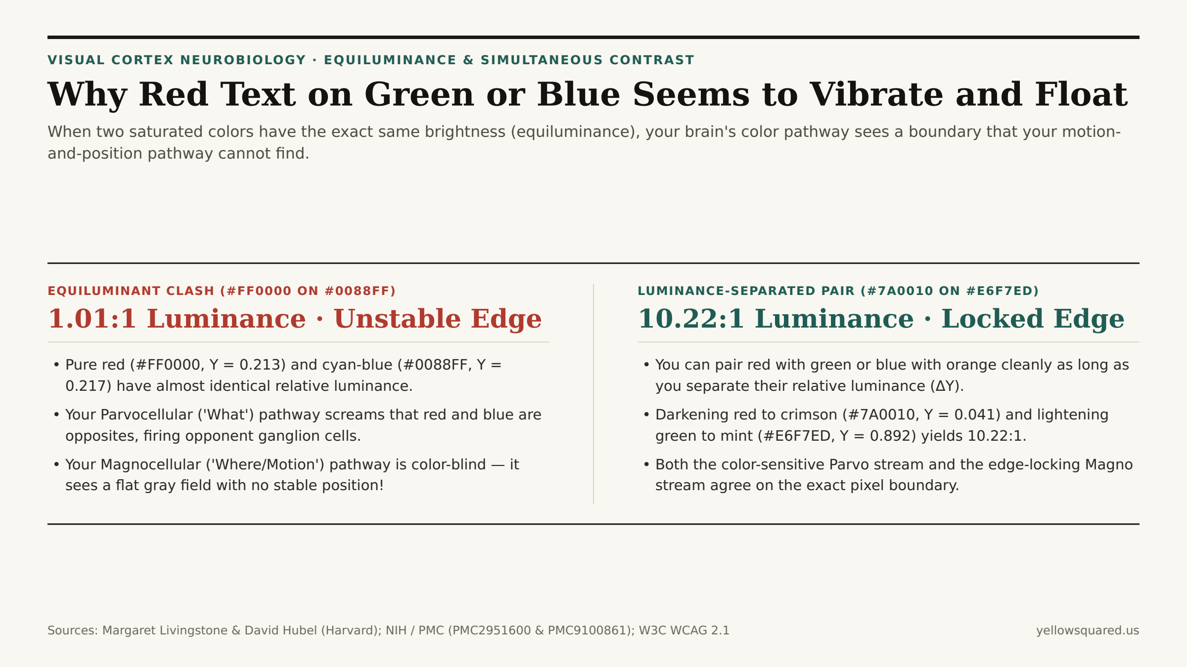
#FF0000, relative luminance Y = 0.213) and cyan-blue (#0088FF, Y = 0.217) have a 1.01:1 luminance ratio — causing your color-sensitive Parvo pathway to see a border that your color-blind Magno position pathway cannot locate.1. Why Your Brain's "Where / Motion" Pathway Is Completely Color-Blind
Human vision is not processed by a single unified camera sensor in the brain. Signals leaving the retina travel through the lateral geniculate nucleus (LGN) into the primary visual cortex (V1) along two anatomically distinct parallel highways (Livingstone & Hubel / Magnocellular Pathway and PMC2951600):
- The Parvocellular ("What / Color") Pathway: Fed by small midget ganglion cells (Parvocellular Cells), this pathway subtracts signals from Long (
L, red), Medium (M, green), and Short (S, blue) cones to compute color opponency (Red vs. GreenandBlue vs. Yellow). It tells you what color an object is, but it is temporally sluggish and cannot lock spatial position during rapid eye movements. - The Magnocellular ("Where / Edge / Depth / Motion") Pathway: Fed by large parasol ganglion cells, this pathway sums
L + Mcone inputs to measure pure achromatic luminance (brightness ΔY). It is 100% color-blind — yet it is responsible for anchoring sharp object borders, 3D depth plane, motion stability, and figure-ground separation!
Now look at the sRGB relative luminance equation (Y = 0.2126R + 0.7152G + 0.0722B):
- Pure saturated red (
#FF0000) has a relative luminance ofY = 0.2126. - Mid-saturated green (
#00AA00) has a relative luminance ofY = 0.278, and bright cyan-blue (#0088FF) has a relative luminance ofY = 0.217.
Place #FF0000 (Y = 0.213) on #0088FF (Y = 0.217), and the WCAG luminance contrast ratio is 1.01:1 (equiluminance)! Your Parvocellular pathway screams that red and blue are polar opposites, while your color-blind Magnocellular pathway sees a uniform gray (0.213 vs. 0.217) with zero border at all. As your eye makes involuntary microsaccades (1–3 times per second), the unanchored color boundary appears to slip, pulse, and vibrate!
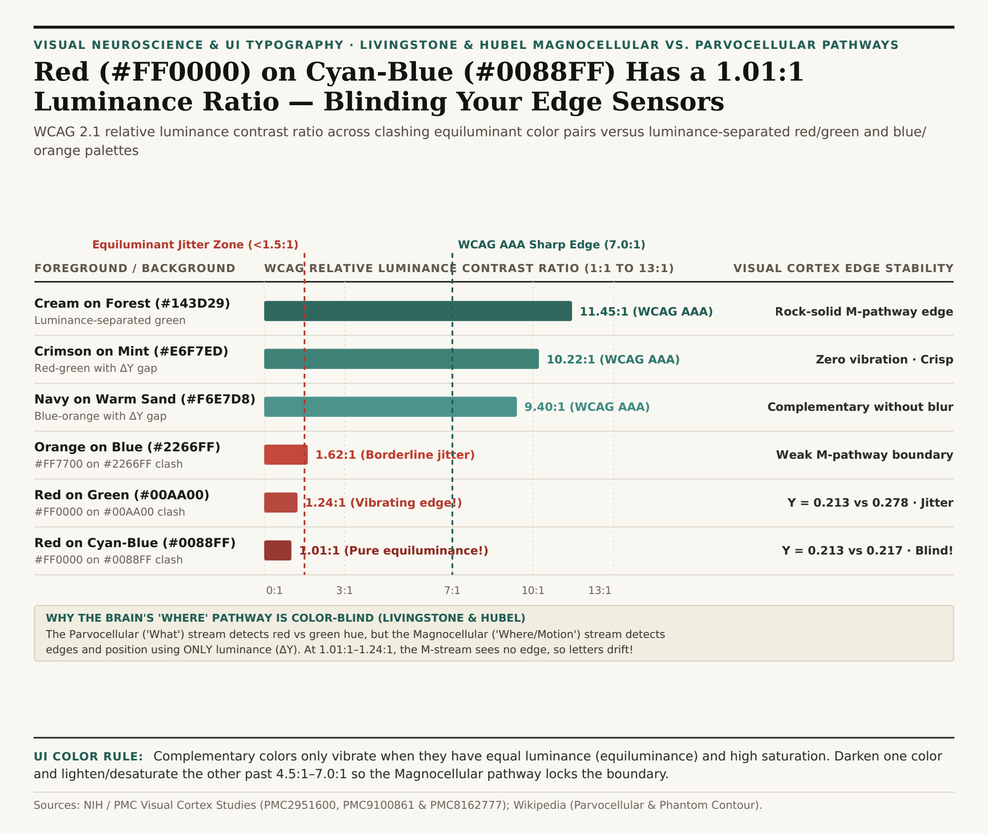
1.01:1–1.62:1). Download the equiluminant color vibration dataset (CSV).2. How Claude Monet Used Equiluminance on Purpose — and How UI Designers Prevent It
Harvard neurobiologist Margaret Livingstone famously showed that Claude Monet exploited equiluminance deliberately in Impression, Sunrise (1872): the glowing orange sun and the surrounding blue-gray morning mist have the exact same luminance when converted to black-and-white (1.0:1), which is why Monet's sun appears to shimmer and pulsate on the canvas!
In a user interface, however, vibrating text destroys readability. Follow two rules to use complementary colors (red/green or blue/orange) without triggering simultaneous-contrast jitter (PMC8162777):
- Enforce a
4.5:1to10:1Luminance Step (ΔY): Never pair two mid-luminance hues (Y ≈ 0.18–0.35). Push one color toward very dark (Y < 0.05, like deep crimson#7A0010or forest#143D29) and the other toward very light (Y > 0.80, like mint#E6F7EDor cream#FAF7F0), raising contrast above7.0:1–10.0:1. - Desaturate the Background Surface: Lowering the chroma (
saturation) of the background container while keeping the foreground badge text crisp eliminates center-surround opponent overstimulation inV1/V4color-glob neurons.
"Convert your UI screenshot to grayscale: if a colored badge or button text disappears into the background in black-and-white, it is equiluminant — and it will vibrate in color because your Magnocellular pathway cannot see the border."
| Color Pair | FG / BG Hex | Luminance (Y) |
WCAG Contrast | Magnocellular / Visual Outcome |
|---|---|---|---|---|
| Red on Cyan-Blue (Clash) | #FF0000 / #0088FF |
0.213 vs. 0.217 | 1.01:1 (FAIL) | Pure equiluminance; severe border jitter |
| Red on Green (Clash) | #FF0000 / #00AA00 |
0.213 vs. 0.278 | 1.24:1 (FAIL) | Classic holiday banner shimmer & eye strain |
| Orange on Electric Blue | #FF7700 / #2266FF |
0.312 vs. 0.168 | 1.62:1 (FAIL) | Weak M-pathway edge; opponent halo |
| Navy on Warm Sand | #102A56 / #F6E7D8 |
0.024 vs. 0.812 | 9.40:1 (AAA) | Blue-orange harmony with locked M-edge |
| Crimson on Soft Mint | #7A0010 / #E6F7ED |
0.041 vs. 0.892 | 10.22:1 (AAA) | Red-green contrast with zero vibration |
| Cream on Deep Forest | #FAF7F0 / #143D29 |
0.931 vs. 0.036 | 11.45:1 (AAA) | Crisp figure-ground separation |
Testing Equiluminance and Grayscale Separation in Your Palette
Whenever you design status pills, alert banners, or data-visualization legends that combine warm and cool hues, check their relative luminance (Y) before shipping. Audit luminance contrast and chromatic vibration in Lumet to verify that every foreground/background pair clears 4.5:1 to 7.0:1, and download the equiluminant color vibration CSV table.