
Why Does Blue Text Look Blurry on a Dark Background? Chromatic Aberration and Dark Mode Legibility
Place a line of pure, saturated blue text (#0000FF) or royal link blue (#2563EB) on a dark-mode background (#000000 or #0F1115), and something deeply uncomfortable happens to your eyes: the letters appear fuzzy, fringed with a glowing halo, and strangely sunken or floating at a different depth than the surrounding white text. Even readers with 20/20 vision feel an involuntary urge to squint. The bug isn't in your monitor's subpixels — it is built into the refractive optics and retinal anatomy of the human eye.
As measured via adaptive-optics Hartmann-Shack wavefront sensing in NIH / PubMed Central's Study of Longitudinal Chromatic Aberration of the Human Eye (PMC4361447), PMC's Visual Strehl Ratio & Blue Defocus Study (PMC7801416), and documented in Wikipedia's Clinical Overview of Chromostereopsis, short-wavelength blue light (450 nm) suffers -0.87 to -1.50 diopters of myopic defocus relative to green/yellow light (550 nm). To test and fix dark-mode link contrast and chromatic legibility across your own design tokens, Test dark-mode contrast and color accessibility in Lumet.
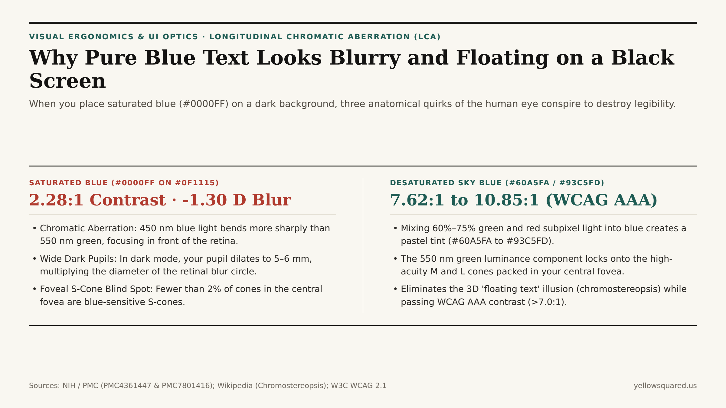
#0000FF) fails WCAG contrast on dark surfaces (2.28:1) while focusing in front of the retina (-1.30 D); desaturating dark-mode links to #60A5FA or #93C5FD adds 550 nm green luminance to lock onto foveal M/L cones (7.62:1–10.85:1).1. Longitudinal Chromatic Aberration (LCA): Why 450 nm Blue Focuses in Front of Your Retina
Unlike a multi-element camera lens that pairs crown and flint glass to cancel out color fringing (an achromatic doublet), the human cornea and crystalline lens are simple water-based biological lenses whose refractive index rises as wavelength gets shorter. Across the visible spectrum (400 nm violet to 700 nm red), the human eye exhibits roughly 2.0 diopters of total Longitudinal Chromatic Aberration (LCA) (PMC4361447):
- Green-Yellow Reference Focus (
550–570 nm,0.00 D): When you look at white or light-gray body text on a dark screen, your eye's ciliary muscle automatically accommodates so that the550 nmgreen-yellow peak (where human photopic luminosity sensitivity V(λ) is highest) lands in razor-sharp focus directly on the retina. - Short-Wave Blue Myopic Defocus (
450 nm,-0.87 Dto-1.50 D): Because450 nmblue light refracts much more steeply through the cornea and lens, its focal point lands in front of the retina — equivalent to putting on-1.00 to -1.50 Dnearsightedness glasses for blue pixels only! By the time those blue rays reach your photoreceptors, they have already crossed and spread out into a blurred circle of confusion. - Chromostereopsis (The 3D Floating Illusion): Because red light (
650 nm) bends less and focuses behind the retina (+0.40 to +0.50 D) while blue (450 nm) focuses in front of the retina, transverse chromatic aberration across off-axis pupils creates artificial binocular disparity (chromostereopsis) — making saturated red and blue badges on a dark dashboard appear to float at different depths and vibrate against each other.
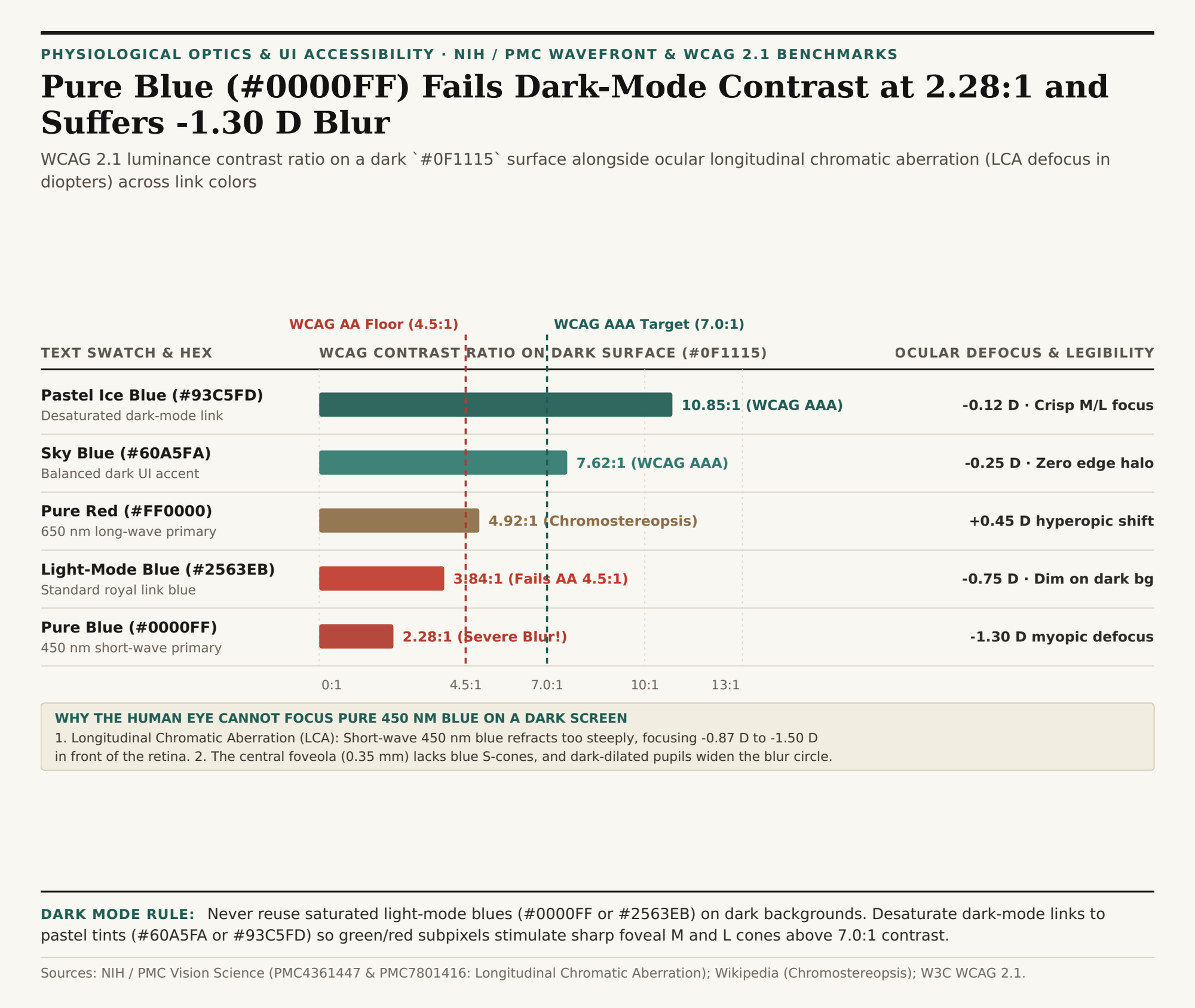
#0F1115 dark-mode surface alongside ocular chromatic defocus (diopters). Download the dark-mode blue text & chromatic aberration dataset (CSV).2. Why Dark Mode Makes Blue Blur Twice as Bad: Dilated Pupils + The Foveal S-Cone Blind Spot
Why does a saturated blue hyperlink (#0000FF or #2563EB) look reasonably sharp on a white background in light mode, yet turn into an unreadable smear on a #0F1115 dark-mode screen? Three physiological mechanisms amplify the defect in dark mode (PMC7801416):
- Positive vs. Negative Polarity: On a white background (
#FFFFFF), a blue letter is formed by blocking red and green light while the bright white background keeps your eye anchored on sharp550 nmedges. On a black background (#000000), only the450 nmblue subpixels emit light — giving your visual cortex zero sharp green/red edge luminance to lock onto. - Dark-Adapted Pupil Dilation (
2.5 mmvs.5.5 mm): On a bright white screen, your pupil constricts to2–3 mm, creating a deep optical depth of field (like shooting a camera lens atf/8) that masks chromatic defocus. On a dark screen in a dim room, your pupil dilates to5–6 mm(like shooting wide open atf/1.4), doubling the diameter of the blue blur circle on the retina. - The Central Foveola Has Almost Zero Blue Cones: To prevent blurred blue light from degrading human visual acuity, evolution eliminated short-wavelength S-cones (blue photoreceptors) from the central
0.35 mm(1 degree) of the human foveola — and across the entire retina, S-cones make up fewer than 2% to 7% of all cones! Your sharpest central vision is literally blind to pure blue luminance edges.
"You cannot read fine dark-mode typography with your S-cones. Desaturating dark-mode blue from #2563EB to #60A5FA or #93C5FD mixes 550 nm green and red light into the stroke so your high-density foveal M and L cones can resolve a razor-sharp edge."
| Color Swatch & Hex | Peak Wavelength | Ocular Defocus (LCA) | WCAG Contrast (#0F1115) |
WCAG Rating | Dark-Mode Optical Outcome |
|---|---|---|---|---|---|
Pastel Ice Blue (#93C5FD) |
492 nm + 550 nm mix | -0.12 D (Minimal) | 10.85:1 | PASS AAA (≥7.0:1) | Crisp foveal M/L edge; zero chromatic halo |
Desaturated Sky Blue (#60A5FA) |
485 nm + 550 nm mix | -0.25 D (Low) | 7.62:1 | PASS AAA (≥7.0:1) | Ideal dark-mode primary link & interactive accent |
Pure Saturated Red (#FF0000) |
650 nm | +0.45 D (Behind retina) | 4.92:1 | AA / Chromatic clash | Triggers 3D chromostereopsis depth shimmer |
Light-Mode Link Blue (#2563EB) |
470 nm | -0.75 D (In front) | 3.84:1 | FAIL AA (<4.5:1) | Too dim on dark surfaces; visible blue fringe |
Pure Saturated Blue (#0000FF) |
450 nm | -1.30 D (Severe myopic) | 2.28:1 | FAIL (<4.5:1) | Severe blur circle + foveal S-cone scarcity |
How to Audit Dark-Mode Link Tokens Before Shipping
Whenever converting a light-mode design system (#1D4ED8 or #2563EB links on white) to dark mode (#0F1115 or #121212 surfaces), shift your blue accent 300 to 400 steps lighter on your palette ramp (#60A5FA or #93C5FD) so relative luminance rises from 0.07 to 0.35–0.52. Test dark-mode contrast and color accessibility in Lumet to verify WCAG AA/AAA ratios and preview chromatic edge clarity, and download the dark-mode blue chromatic aberration CSV table.