YellowSquared  /  Field notes

Notes from the workshop

28 posts, newest first. Choose an app to narrow the feed.

025 / 28

How to Add EXIF Data to a Photo: Hidden Tags or Visible Text?

To add EXIF data to a photo, decide whether you need machine-readable information stored in the file or camera details printed visibly on the image. A metadata editor changes file tags. A camera stamp is part of the picture's pixels. They solve different problems.

EXIF can hold details such as the camera, lens, exposure settings, capture date and location. Which fields exist depends on the original photo. If you want a portfolio or social image that shows those details at a glance, use a visible overlay. If another app needs to read the details, edit or preserve the file metadata instead.

Choose the result you need

  • Check what is already recorded: open the photo's information panel or inspect its file. Viewing tags does not change the photo.
  • Correct an iPhone photo's date or location: use Apple Photos' Adjust Info controls for the photo library record.
  • Write a tag such as artist or copyright: use a metadata editor to write the machine-readable field into the image file.
  • Show camera settings on the image: use an overlay such as BatchPad's EXIF stamp. It draws visible text without editing the hidden tags.

First check whether the details are already there

On iPhone, open a photo in Photos and swipe up or tap the Info button. Apple says the panel can show the device and camera details, including lens and shutter speed, when the photo contains them. From the More menu, choose Adjust Info to change the date and time or location. You can select several photos to adjust those fields together, and Apple provides a way to revert the changes.

If the camera, lens or exposure tags are missing, the pixels alone do not tell you with certainty which equipment or settings produced them. Add only values you can verify from a reliable record; do not guess a camera model or shutter speed.

Write embedded metadata when another app needs to read it

For tags such as an author name, description or copyright notice, use a tool that edits image metadata. ExifTool can read and write metadata in many file types. For example, this writes an Artist tag to a JPEG:

exiftool '-Artist=Your Name' \
  photo.jpg
exiftool -Artist photo.jpg

The second command reads the saved value back so you can check it. ExifTool keeps the original by adding _original to its filename by default. Work on a copy anyway, then verify the new file in the software that needs to use the tag. Keep recorded camera settings truthful: changing an ISO tag does not mean the photo was actually captured at that ISO.

Apple's documented controls do not edit arbitrary camera or lens tags. Use a metadata editor for those fields and check its supported tags and file formats.

Put camera details visibly on the image

A visible stamp is useful when viewers should see the camera or settings without opening an information panel. In BatchPad, add an EXIF overlay, choose the fields and layout, adjust its style and position, then preview it across the selected photos. The overlay reads available source-photo details. An on-image value override changes the stamp's text; it does not rewrite the file's hidden EXIF tags.

Diagram comparing EXIF tags stored with a photo file to camera details printed visibly over the image
Embedded tags can be read by metadata software. A visible stamp is part of the picture people see.

For a portfolio series, BatchPad can apply one overlay layout to a selected photo group while reading each image's available source values. You can keep the capture details in a consistent position, then move through the photos to check the result. The example below places ISO, aperture, shutter speed and focal length along the photo's lower edge.
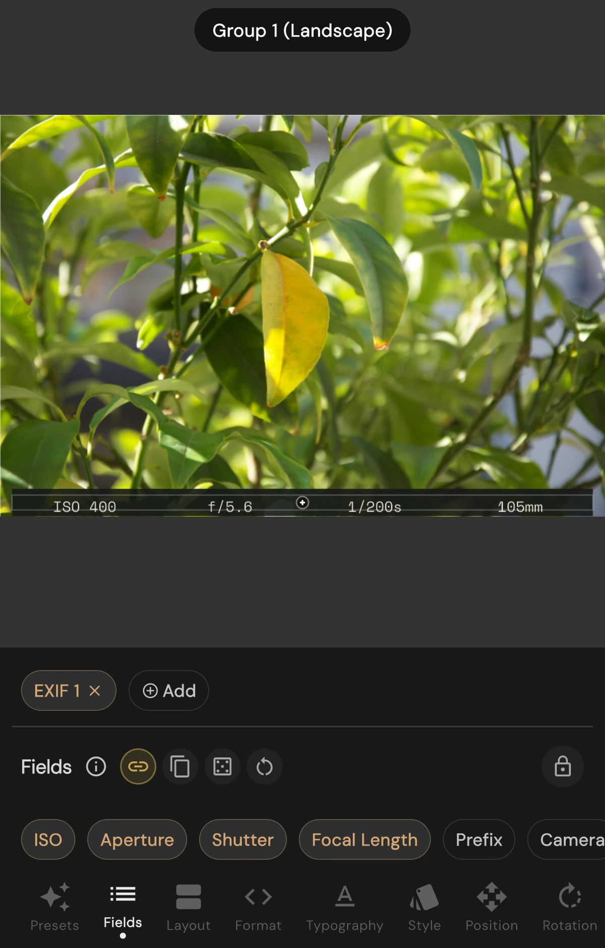
BatchPad EXIF Fields controls with ISO, Aperture, Shutter and Focal Length selected, and their values drawn along the photo's lower edge
Cropped simulator example with a sample photo: the selected fields appear in a consistent footer. This shows the visible overlay and its controls; inspect the exported file separately to check its embedded metadata. Captured 6 October 2026 in BatchPad 5.1.2.

If you also need the original EXIF in a BatchPad export, turn on the Metadata option and export as JPEG. The current exporter copies the source EXIF into JPEG output when that option is enabled; its PNG path does not copy the source EXIF segment. Preserving the source metadata keeps existing values, but it does not turn the visible stamp into new file tags. Check the exported file before you rely on either result.

Location can be part of a photo's metadata. Before sharing a file with metadata preserved, check whether it includes GPS information and whether you want to share that location.

A quick check before sharing

  • Open the exported file and confirm the fields that should be machine-readable.
  • View the image itself to check that the visible stamp is legible and accurate.
  • Check date, location and GPS fields before sending the original file.
  • Keep an untouched copy so you can correct a tag or make a clean version later.

Use BatchPad when you want a consistent camera-details overlay across a photo set. For a name or logo watermark, see the portfolio watermark checklist.

Sources

026 / 28

How to Batch Watermark Photos for a Portfolio

To batch-watermark portfolio photos, choose one restrained mark, place it where it does not cover the subject, apply it across a representative set, and inspect the exported images at the size you will share. Keep clean source files so you can change the mark or make an unwatermarked version later.

A watermark works best when it supports the photograph. A small name or logo can make a group of images feel consistent; a mark that competes with the subject makes the viewer work around your branding. The workflow below helps you check both consistency and legibility before exporting a full set.

1. Decide what the mark needs to identify

Choose a short studio name, photographer name, or web address that viewers can read without pausing. Use a logo if people already recognize it; use text if the logo becomes too intricate at a small size. Avoid adding several lines of contact details. The mark should tell a viewer who made the image or where to find more, not repeat the caption.

Use one design for images that belong together. If a client gallery and a public portfolio need different labels, treat them as separate export sets instead of changing the mark halfway through one batch.

2. Pick a size and position that leave the photo in charge

Start with a corner or quiet strip of the frame, then check that location against the subject in each image. A lower corner may work on one landscape and sit directly on a face, signature, or product label in the next. Move the mark when the composition needs it; consistency does not require covering the same part of every photograph.

Keep a visible margin from the edge so the mark does not feel clipped or disappear into a border. Reduce the size until it reads as a signature at the intended viewing size. If someone notices the watermark before the subject, make it smaller, lighter, or move it to a less prominent area.

3. Check the mark against different backgrounds

Test the design on a few photos with different tones and textures before applying it to the whole group. A pale logo can disappear over a bright wall; a dark logo can become hard to read in a shadow. A detailed image can make thin lettering difficult to distinguish even when the same mark looks clear over a plain background.

Photo to testWhat to look forPossible adjustment
Bright or pale areaDoes the mark fade into the background?Try a darker treatment or a different quiet area.
Dark areaDoes a light mark pull attention away from the subject?Reduce its size or visibility, or choose another position.
Busy detail near an edgeDoes the mark obscure texture, a face, or an important object?Move it to open space or leave that image out of this batch.
Portrait and landscape framesDoes the same corner stay clear in both shapes?Use separate setups when one position does not fit both orientations.

4. Apply the setup to a small proof set

Select a few representative photographs first: one light, one dark, one with a busy background, and both portrait and landscape frames if the set contains them. Apply the same watermark treatment, then review each result. This catches a placement that looked good on the first image but collides with a subject in another.

BatchPad lists batch photo processing and custom watermarks among its features. Configure the mark for the images you selected, then check the rendered results before continuing with the rest of the portfolio. Its BatchPad page describes the current feature set.

5. Inspect the exported files at their intended size

Review the images at the size people are likely to see them, such as a portfolio grid or a full-screen gallery. Check the spelling, edge margin, orientation, and whether the mark remains readable without dominating the composition. A zoomed-in preview can help spot a collision, but judge the overall balance at normal viewing size too.

Save watermarked exports as a separate set. Keeping clean originals makes it possible to revise the branding, create a different crop, or share an image without the mark later.

Before sharing the batch

  • The name or logo is correct and easy to read.
  • The mark stays clear of faces, signatures, labels, and other important details.
  • Light, dark, portrait, and landscape examples have all been reviewed.
  • The mark is consistent across the set without forcing one placement onto every composition.
  • Clean source files and the watermarked exports are stored separately.

A restrained watermark gives a portfolio set a consistent signature. If the mark is the first thing you notice in a thumbnail, reduce it or choose a quieter placement before exporting the rest.

027 / 28

Why a Sharp Camera Photo Can Look Soft on Instagram

A sharp original can look softer in a feed because the smaller image cannot preserve every detail in the camera file. Resizing, compression, sharpening and the way the app displays the picture all affect the result. Exporting at a chosen size gives you a chance to judge those trade-offs before uploading.

Imagine a portrait with individual strands of hair visible on a large monitor. Reduce it to a phone-sized image and several strands may fall within the same output pixel. The editor has to combine that information. The original can be perfectly focused while the smaller version loses the texture that made it feel sharp.

The useful math: fewer pixels carry the picture

A 48-megapixel image might measure 8,000 × 6,000 pixels. A square crop from that file could be 6,000 × 6,000. Export that square at 1,080 × 1,080 and its pixel count falls from 36 million to about 1.17 million: roughly 3.2% of the square crop's original count.

That percentage measures the number of pixels, not a percentage of visual quality. Large shapes can survive the reduction very well. Fine fabric, grass, hair and subtle gradients are harder because their detail has to fit within the smaller grid.

Worked exportDimensionsPixel count
Square, 1:11,080 × 1,0801.17 million
Portrait, 4:51,080 × 1,3501.46 million
Portrait, 3:41,080 × 1,4401.56 million

These are sizing examples. Choose a ratio available in the app's current upload flow, then check its preview. They are not a promise that Instagram will retain that exact file or skip further processing.

Crop before you sharpen

Start with the intended frame. A crop changes the picture's composition as well as its pixel budget. A loose portrait may need a tighter crop to make the face readable in a feed; a landscape may need larger, simpler shapes to retain its impact.

Next, resize a copy to the intended output dimensions. Judge it at its actual display size. Zooming to 400% can help diagnose a defect, but it is a poor way to decide whether a photo looks good on a phone.

Apply modest output sharpening after resizing. Stop when edges look clear without bright outlines or gritty skin. The right amount depends on the subject, editor and output size; a fixed slider setting cannot suit every file.

A repeatable export workflow

  1. Keep the original. Make social exports from a copy so future crops can use the full file.
  2. Choose the frame. Put the important subject where it will remain readable at feed size.
  3. Export a resized version. Use the dimensions appropriate to your chosen format and current platform guidance.
  4. Use a compatible colour workflow. For a conventional SDR JPEG, sRGB is a practical starting point. Display brightness, HDR handling and app processing can still change its appearance.
  5. Inspect the result. Look at fine texture, gradients and high-contrast edges on the device you expect viewers to use.
  6. Compare an upload. Keep the crop and scene constant when comparing export settings.

There is no universal quality slider fix

A JPEG quality number is an encoder setting, not a platform guarantee. Two editors can produce different files at the same number. A low setting can add visible artifacts; an unnecessarily large file does not guarantee a better displayed image.

Claims that a particular width, file size or quality percentage “bypasses compression” need direct evidence from the platform. Pre-sizing is useful because it lets you inspect your own reduction and sharpening decisions.

When several images belong together

Use the same output dimensions for a series where consistency matters. Preview every image: a setting that works for a simple wall may struggle with leaves or fine patterned clothing. For a panorama, calculate the complete canvas before cutting it into panels; see the carousel sizing guide.

BatchPad helps prepare consistent crops across a set of images. The final quality check is still the exported picture and its upload preview.

Sources and scope

Consult Instagram's photo-resolution guidance for current platform rules. The calculations above describe image geometry; they do not describe Meta's internal resizing or compression implementation. Adobe's image size and resolution guide explains how dimensions and resampling relate.

028 / 28

How to Split a Panorama Across an Instagram Carousel

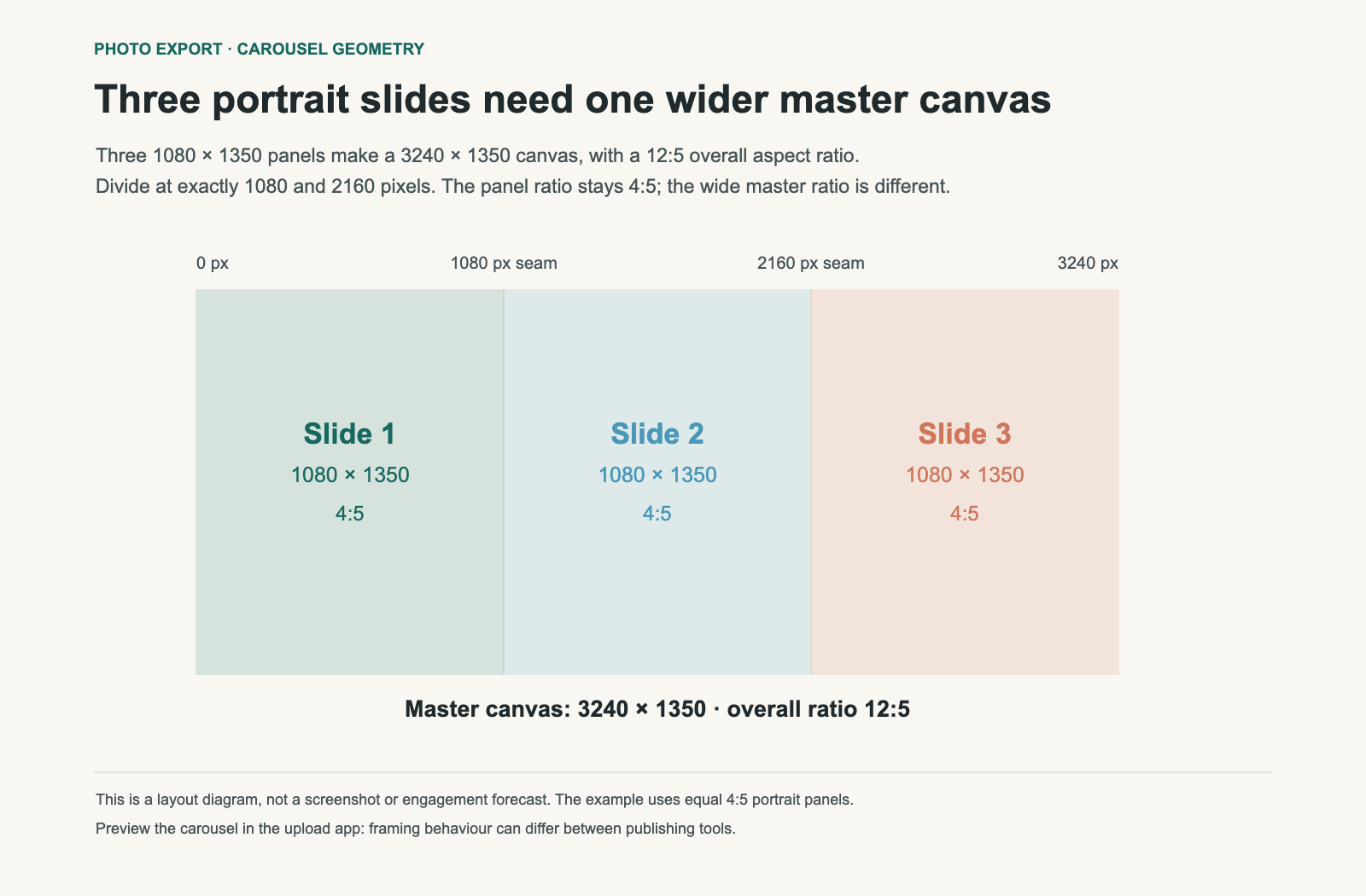
A three-slide panorama made from 4:5 portrait panels needs a 12:5 master image. The number of panels tells you how much wider the complete canvas becomes; the shape of each panel still determines its height.

Picture a skyline with a tower near the centre. You want the view to continue across three swipes. If you first crop it to 3:1 because there are three slides, then force each piece into a portrait frame, something has to be cropped or padded. Calculating the master canvas first avoids that surprise.

Three adjacent 1,080 by 1,350 panels form a 3,240 by 1,350 canvas, an aspect ratio of 12:5.
Worked example: three 4:5 panels share one 3,240 × 1,350 master. Each cut is exactly 1,080 pixels wide. The image continues across panel boundaries because every panel comes from the same canvas.

Calculate the canvas before slicing

For N equal panels, multiply the panel width by N and keep its height. If a panel is 1,080 × 1,350, three panels require 3,240 × 1,350. Reduce the ratio and you get 12:5.

Panel shapeOne panelThree-panel masterMaster ratio
Square1,080 × 1,0803,240 × 1,0803:1
4:5 portrait1,080 × 1,3503,240 × 1,35012:5
3:4 portrait1,080 × 1,4403,240 × 1,4409:4

The last row shows the geometry if you choose a 3:4 format supported in your upload flow. Check the app's current options and preview before preparing the complete set. Platform presentation can change independently of this math.

Compose for individual slides as well as the whole view

The entire panorama can look balanced while its first slide contains only empty sky. Place enough visual interest in the opening panel for it to make sense on its own. Then let a road, horizon or repeated shape carry the viewer into the next frame.

Avoid placing the most important face, lettering or landmark directly on a cut. Continuity can survive a seam, but a viewer may pause on an individual slide. A slightly different master crop can put a key subject safely inside a panel without changing the overall idea.

Keep edits consistent across the seam

Edit exposure, colour and the overall crop on the complete master, then slice it. Separate auto adjustments can make neighbouring panels differ in brightness or colour. The seam becomes visible even when the pixel coordinates are correct.

For the three-panel example, cut at horizontal positions 1,080 and 2,160. Use equal integer widths and the same export settings. Number the files in order. A panel accidentally uploaded out of sequence can look like a crop error.

Check these four things before posting

  1. Dimensions: every panel has the same width and height.
  2. Sequence: the right edge of panel one continues into the left edge of panel two.
  3. Alignment: the horizon and other long lines remain at the same height.
  4. Upload preview: the app has not applied a new crop, rotation or padding to a panel.

A carousel uses several frames to reveal more of the scene; it does not preserve all the source file's detail automatically. Each frame still has a finite output resolution and can undergo platform processing. See why a large camera file can look softer in a feed for the resizing part.

When a panorama split is useful

A continuous landscape, long interior or horizontal illustration can work well. An image that needs all its parts visible at once may be better as a single landscape frame. A carousel asks the viewer to reconstruct the complete image over several swipes.

BatchPad is useful for preparing consistent image dimensions. The sizing diagram here is a geometry example, not a claim about automatic panorama slicing in any particular app. Download the panel dimensions.