YellowSquared  /  Field notes

Notes from the workshop

28 posts, newest first. Choose an app to narrow the feed.

017 / 28

PNG vs. JPEG vs. WebP: Which Image Format Is Best for Text and Photos?

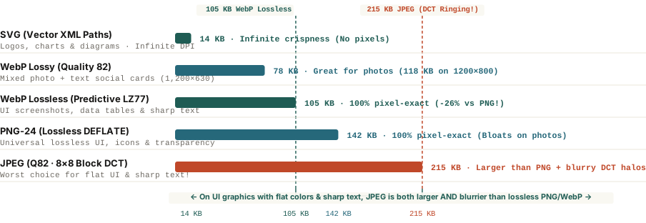
Because JPEG divides images into 8×8 pixel blocks and approximates them with smooth cosine waves (DCT), sharp typography creates 'mosquito noise' ringing halos and bloated files—whereas lossless PNG and WebP collapse flat UI backgrounds with zero blur.

Export an analytics chart, a software screenshot, or a social media quote card as a `.jpg` file to "save space," upload it to your website or LinkedIn feed, and look closely at the letters: every crisp black character is surrounded by a dirty gray halo of speckled pixels, and solid colored buttons look blotchy. Even more surprisingly, if you compare that blurry `.jpg` file (`215 KB`) against a crystal-clear lossless `.png` export (`142 KB`) or `.webp` export (`105 KB`) of the exact same graphic, the JPEG is actually 50% to 100% larger in file size.

Why does JPEG—the undisputed workhorse of digital photography—fail so badly on text, screenshots, and UI graphics, while PNG balloons to over `1,100 KB` when you save a camera photograph? The answer lies in the mathematical difference between frequency-domain cosine waves (`DCT`) and spatial dictionary run-length coding (`LZ77`).
File size in kilobytes and typography edge sharpness comparing SVG, WebP Lossy, WebP Lossless, PNG-24, and JPEG on a 1200x630 UI card
Figure 1: File size (`KB`) and typography edge fidelity on a `1,200×630` UI and text graphic across five web image formats. Download benchmark dataset: png-vs-jpeg-vs-webp-best-format-for-text-and-photos.csv.

Why JPEG Blurs Text and Bloats on Flat Colors: 8×8 DCT & Gibbs Ringing

Designed by the Joint Photographic Experts Group in 1992 for continuous-tone camera photographs, JPEG compresses images through three lossy steps that are ideal for sunsets and portraits but destructive for typography:

  • `4:2:0` Chroma Subsampling: Because human eyes are more sensitive to brightness (luminance) than color detail (chrominance), JPEG typically discards 75% of the color resolution (averaging color across `2×2` pixel blocks). On small colored text or thin UI lines, this immediately bleeds color across adjacent pixels.
  • The `8×8` Discrete Cosine Transform (`DCT`): JPEG slices the image into tiny `8×8` pixel tiles and represents each tile as a sum of 64 smooth cosine wave frequencies, then discards high-frequency waves via quantization.
  • Gibbs Phenomenon ("Mosquito Noise"): A real-world photograph rarely jumps from pure white to pure black in a single pixel, so smooth cosine waves approximate it effortlessly. A crisp letter or UI border, however, is a mathematical step function. When you try to reconstruct a sharp step edge using truncated cosine waves, the waves overshoot and oscillate on both sides of the edge—creating visible Gibbs ringing halos ("mosquito noise") and forcing the encoder to spend extra bytes encoding all 64 frequency coefficients inside every text tile.

JPEG tries to draw razor-sharp letters using smooth ocean waves; PNG and lossless WebP simply count how many identical background pixels sit in a row.

Why PNG and WebP Win on UI Graphics (and How to Choose)

Instead of converting pixels into cosine waves, PNG (`DEFLATE = LZ77 + Huffman`) and WebP Lossless scan pixels spatially. When an editorial chart or UI screenshot has 400 identical `#f9f7f1` background pixels in a row between two crisp `#161514` letters, `LZ77` dictionary compression collapses that entire horizontal run into a few bytes with 100% lossless pixel accuracy.

  1. Use `WebP Lossless` or `PNG-24` for Text, Screenshots & Carousels: According to Google's official WebP Compression Study, WebP Lossless uses spatial neighborhood prediction and green-channel subtraction (`subtract green transform`) to produce files 26% smaller than PNG (`105 KB` vs. `142 KB`) with zero generation loss and full 8-bit alpha transparency. When uploading to social platforms that require legacy raster formats, export at 2× retina resolution in PNG-24 so the platform's internal transcoder receives clean edges.
  2. Use `WebP Lossy (Q80–85)` or `JPEG` for Camera Photographs: On noisy camera photos where no two adjacent pixels are identical, PNG cannot find repeating pixel runs and balloons to `1,180 KB`. Lossy WebP (`118 KB`, 25%–34% smaller than JPEG) and JPEG (`172 KB`) excel here.
  3. Use `SVG` for Vector Logos, Icons & Data Charts: Whenever an asset is generated from geometric paths and text rather than camera pixels, SVG (`14 KB`) delivers infinite resolution at a tenth of the file size.

When exporting high-craft social documentation, quote cards, or technical walkthroughs, you can Plan multi-slide carousels in BatchPad with crisp typography and deterministic slide dimensions.
018 / 28

Why Do Photos Look Dull After Uploading Online? Display P3 vs. sRGB Guide

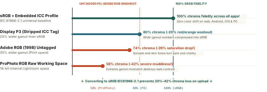
When wide-gamut images edited in ProPhoto RGB, Adobe RGB (1998), or Display P3 (+25% wider gamut) are uploaded to web pipelines that strip ICC tags and assume sRGB, RGB values map onto narrower primaries—cutting perceived saturation by 20% to 42%.

Every photographer and digital creator has hit this wall at least once: you spend twenty minutes perfecting a golden-hour portrait or landscape in Lightroom or Photoshop on a MacBook Pro or iPad. The skin tones glow, the terracotta reds pop, and the shadow contrast looks crisp. Then you export a JPEG, upload it to a website, client portal, or social scheduler, and open it on another tab or phone—only to find the colors looking pale, chalky, and lifeless, as if someone dragged the saturation slider down by 25 points.

Your monitor is not broken, and the platform did not apply a secret desaturation filter. Instead, your image fell victim to an untagged wide-gamut color space mismatch—specifically the gap between internal editing spaces (ProPhoto RGB, Adobe RGB 1998, and Apple's Display P3) and the universal baseline of the web (sRGB IEC61966-2.1).

Perceived chroma retention on the web comparing sRGB exports with untagged Display P3, Adobe RGB, and ProPhoto RGB
Figure 1: Perceived color chroma retention (%) when files exported in four color spaces are rendered in an un-managed sRGB web pipeline. Download gamut comparison table: why-do-photos-look-dull-online-srgb-vs-display-p3-color-space.csv.

The Math of the Washout: Why RGB `[220, 50, 30]` Is Relative

An 8-bit JPEG stores every pixel as three numbers from `0` to `255`—for example, `R=220, G=50, B=30`. By themselves, those three numbers do not specify an absolute physical color; they specify a percentage of the maximum red, green, and blue primary coordinates defined by the file's color space:

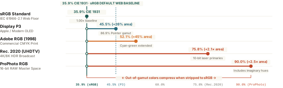
  • sRGB (`IEC 61966-2.1` — 35.9% of CIE 1931): Created by HP and Microsoft in 1996, sRGB is the universal default of the internet, Windows, Android, and social media compression engines.
  • Display P3 (45.5% of CIE 1931 — +25% Larger Than sRGB): Used natively by modern Apple MacBooks, iMacs, iPhones, and high-end OLED monitors. Its primary red and green coordinates sit significantly further out toward the spectral locus, unlocking deeper crimsons, vibrant oranges, and emerald greens.
  • Adobe RGB 1998 (50.6% of CIE 1931) & ProPhoto RGB (90.0% of CIE 1931): Wide working spaces designed for commercial CMYK print prepress and 16-bit raw processing inside Lightroom.

Here is why the washout happens: inside a wide-gamut space like Adobe RGB or Display P3, a moderately vibrant orange only needs a numerical value of `R=205, G=85, B=50` because the red primary at `255` is so extreme. When you upload that file to a web compressor or viewer that strips the embedded ICC profile tag and assumes the file is standard sRGB, the display renders `R=205, G=85, B=50` relative to the much narrower sRGB primaries—shrinking perceived saturation by 20% (from P3), 26% (from Adobe RGB), or 42% (from ProPhoto RGB).

Exporting in Adobe RGB for the web doesn't give viewers more colors—it hands them wide-gamut numbers that get misinterpreted as washed-out sRGB pastels.

The 3-Step Export Fix for Lightroom and Photoshop

  1. Convert to sRGB (Never "Assign"): In Lightroom's Export dialog under File Settings, set Color Space: sRGB. In Photoshop, always use Edit → Convert to Profile → Working RGB: sRGB IEC61966-2.1 (which mathematically recalculates `[205, 85, 50]` up to `[242, 72, 38]` so the visual color stays identical). Never use Assign Profile, which swaps the label without recalculating the numbers.
  2. Check "Embed Color Profile": In Photoshop's Export As or Save for Web (Legacy) dialog, always check both Convert to sRGB and Embed Color Profile. The ICC tag adds less than 3 kilobytes to the file and tells P3-capable Apple and Android displays exactly how to map the sRGB primaries without over-saturating skin tones.
  3. Soft-Proof Saturated Reds Before Exporting: Press `S` in Lightroom's Develop module (with Profile set to sRGB) when editing neon signage, scarlet flowers, or fiery sunsets so out-of-gamut P3 colors are tamed gently before export.

To export multi-slide social carousels that preserve exact sRGB color fidelity and crisp 1,080-pixel geometry across every slide, you can Plan multi-slide carousels in BatchPad directly in your browser.

019 / 28

Best Instagram Aspect Ratios: 4:5 Portrait vs. Square vs. Landscape

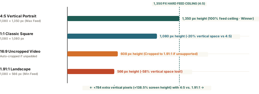
A 4:5 vertical portrait crop (1,080 × 1,350 pixels) occupies 78% more mobile screen real estate than a 1.91:1 horizontal landscape image and 25% more than a 1:1 square—maximizing scroll-stopping dwell time without cropping.

When photographers export a horizontal 3:2 or 16:9 image from Lightroom and upload it directly to the Instagram feed, the result is almost always underwhelming. What looked expansive and cinematic on a 27-inch desktop monitor shrinks into a narrow horizontal ribbon on a smartphone screen—occupying less than a third of the vertical display while two other posts compete for the viewer's attention above and below it.

Because Instagram locks every feed image to a standard width of 1,080 pixels, your choice of aspect ratio directly determines how many vertical pixels your photo commands on screen. Understanding the exact math behind Instagram's three native feed containers—and how to slice wide horizontal images across multi-slide 4:5 carousels—lets you maximize screen real estate without sacrificing wide-angle compositions.

Instagram aspect ratio vertical pixel height comparison between 4:5 portrait, 1:1 square, and 1.91:1 landscape
Figure 1: Rendered vertical pixel height in the Instagram mobile feed at 1,080-pixel width across native aspect ratios. Download specification table: instagram-aspect-ratios-4-5-vs-1-91-1-feed-guide.csv.

The Pixel Math: Why 4:5 Portrait Dominates the Feed

Instagram's feed layout engine enforces two hard aspect ratio boundaries for single image posts and carousels: a minimum flat limit of 1.91:1 and a maximum tall limit of 4:5. Any image uploaded outside those bounds is automatically center-cropped unless you add padding:

  • 4:5 Vertical Portrait (1,080 × 1,350 px): Delivers 1,458,000 total pixels. At 1,350 pixels tall, it fills virtually the entire vertical viewport between the top account header and bottom caption bar on a modern phone—25% taller than a square and 138.5% taller than a landscape post.
  • 1:1 Classic Square (1,080 × 1,080 px): Delivers 1,166,400 total pixels. Gives up 270 vertical pixels (20% of the available height) compared to a 4:5 crop.
  • 1.91:1 Landscape (1,080 × 566 px): Delivers just 611,280 total pixels. A standard 3:2 camera photo (1,080 × 720 px) or 4:5 vertical crop holds more than double the visual detail of a 1.91:1 strip.

In a vertical scrolling feed where width is fixed at 1,080 pixels, aspect ratio is not just a framing choice—it is a 2.38× multiplier on screen area.

How to Showcase Wide Photos Using 4:5 Panoramas

You do not have to abandon horizontal landscape photography to capture the 1,350-pixel vertical ceiling. Instead of uploading a single wide image that shrinks to 566 pixels high, place your wide 3:2 or 16:9 image across a two-slide (2,160 × 1,350 px) or three-slide (3,240 × 1,350 px) 4:5 master canvas and slice it at exact 1,080-pixel intervals.

When building carousels, remember two technical constraints: the first slide locks the aspect ratio for every subsequent slide in the post, and profile grid thumbnails display the center 1:1 square (or 3:4 center crop) of Slide #1—so keep essential typography away from the top and bottom 135-pixel edges. You can Plan multi-slide carousels in BatchPad to slice wide photography into zero-gap 4:5 vertical slides automatically.

020 / 28

Why Do Photos Change Color When Uploaded to Instagram? Display P3 vs. sRGB

Exporting wide-gamut Display P3 or Adobe RGB photos without converting pixels to sRGB IEC61966-2.1 causes unprofiled web renderers to reinterpret chromatic coordinates, desaturating skin tones and shifting reds across the 25 percent wider P3 gamut.

Every photographer and social designer has encountered the same frustrating discrepancy: a portrait or product carousel looks luminous and warm inside Lightroom, Photoshop, or an iPhone camera roll, yet the moment it is uploaded to a social feed or web browser, skin tones turn ashen and vibrant sunset oranges flatten into muddy ochre.

The culprit is almost never JPEG compression alone—though resizing above 1080 pixels triggers aggressive server downsampling. Color shifts happen when an image edited in a wide-gamut working space (such as Display P3, Adobe RGB, or ProPhoto RGB) is exported without converting its underlying RGB pixel triplets into the universal web standard: sRGB IEC61966-2.1.

CIE 1931 chromaticity gamut coverage and unprofiled Delta E color shift across sRGB, Display P3, Adobe RGB, and ProPhoto RGB
Figure 1: Visible spectrum coverage on the CIE 1931 chromaticity diagram and perceptual color error (Delta E) when wide-gamut files are rendered as untagged sRGB. Raw benchmark data: why-do-photos-change-color-on-instagram-srgb.csv.

Why RGB Numbers Mean Different Colors in Display P3 vs. sRGB

An 8-bit RGB pixel does not store an absolute physical wavelength of light; it stores three relative coordinates between 0 and 255 that scale toward the red, green, and blue primary anchors of a specific color space. Under the W3C CSS Color Module Level 4 specification, standard sRGB covers 35.9% of the CIE 1931 chromaticity diagram (and 69.4% of Pointer's real-world surface gamut).

Modern smartphones, MacBooks, and studio OLED monitors utilize Display P3 (standardized under SMPTE EG 432-1), which retains sRGB's D65 white point and transfer curve but pushes the red and green primaries outward. That expansion gives Display P3 45.5% coverage of the CIE 1931 diagram—a 25% to 26% larger color volume than sRGB—while Adobe RGB (1998) spans 52.1% and 16-bit ProPhoto RGB spans 90.0%.

If an upload pipeline strips an image's ICC profile without converting its pixels, a wide-gamut red coordinate is mapped onto a narrower sRGB primary—visibly dulling saturation across the entire frame.

When an unprofiled browser view or third-party scheduling tool reads a raw Adobe RGB or Display P3 file as untagged sRGB, perceptual color error climbs to a Delta E of 4.8 for Display P3 and 8.4 for Adobe RGB—well above the human just-noticeable difference threshold (Delta E < 2.0).

The 3-Step Color-Safe Export Checklist for Carousels

To guarantee that multi-slide carousels and 4:5 vertical portraits render identically across iOS, Android, and desktop browsers:

  • Convert (Never Just Assign) to sRGB: In Photoshop, choose Edit > Convert to Profile > sRGB IEC61966-2.1 before exporting, or select sRGB directly in Lightroom's Export Color Space menu. Converting recalculates the RGB numbers so perceptual hues stay locked inside the sRGB triangle.
  • Embed the ICC Color Profile: Always check Embed Color Profile on export. A compact sRGB ICC v2 profile adds less than 3 KB (<3 KB) to your file size and instructs color-managed mobile displays not to over-stretch sRGB reds to the outer P3 boundary.
  • Match Adjacent Carousel Slices: When building a seamless multi-slide Instagram panorama, verify that every sliced panel shares the exact same 8-bit sRGB profile so seams never show a brightness or tint jump mid-swipe.

To slice wide panoramas and batch-export color-consistent 1080×1350 social slides without manual profile mismatches, you can Plan multi-slide carousels in BatchPad directly in your browser.

021 / 28

How to Make a Seamless Instagram Carousel

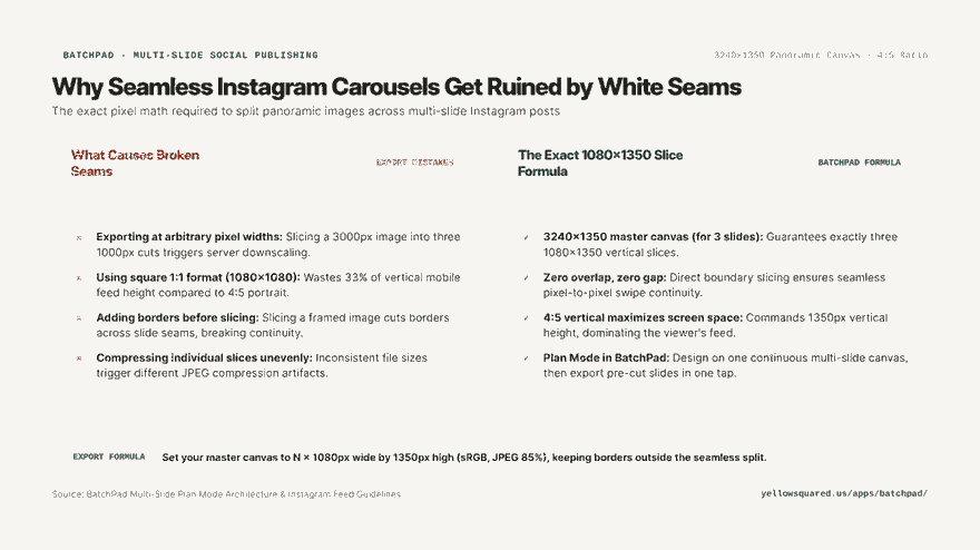
Creating a seamless panoramic swipe across an Instagram carousel requires designing on a continuous canvas sized to exact multiples of 1080 pixels (such as 3240x1350 for a 3-slide vertical post) and slicing with zero pixel overlap. Exporting at arbitrary resolutions or using standard 1:1 square crops forces Instagram’s mobile compression engine to rescale the images, creating visible white seam lines and sacrificing 33 percent of vertical screen height.

Hook card contrasting arbitrary cropping mistakes against the exact 3240x1350 seamless carousel formula.
The pixel geometry of seamless carousels: why arbitrary crops create broken white seam lines on mobile screens.

The multi-slide carousel is the highest-engagement organic format on Instagram, earning significantly higher save and share rates than single static photos. When executed with panoramic continuity—where a wide photograph or editorial layout flows seamlessly across adjacent slides as the viewer swipes—carousels command extended dwell time. However, many photographers discover jarring vertical gaps or blurry seam lines after uploading.

A seamless carousel is an illusion created by pixel math; if your slice width is off by even one pixel, Instagram reveals the seam.

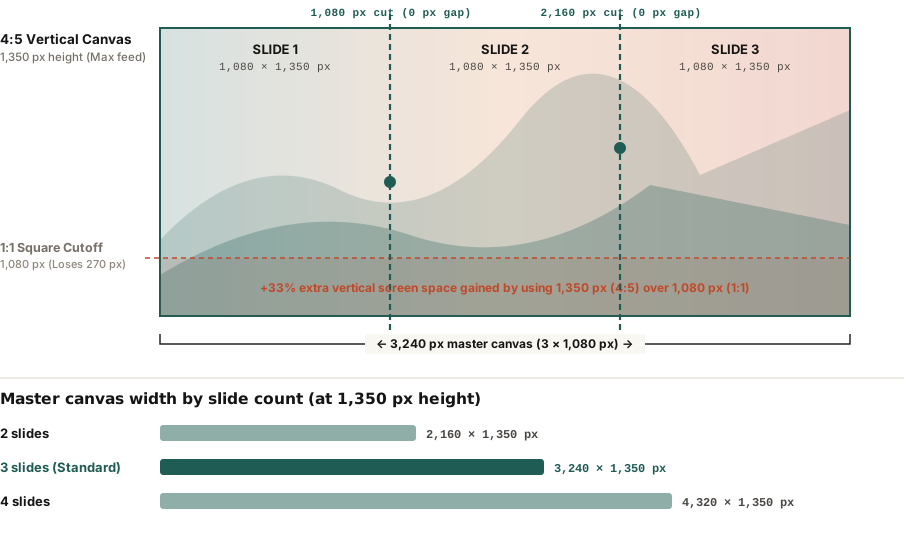
Technical diagram showing a 3240x1350 panoramic master canvas sliced into three exact 1080x1350 vertical slides with zero gap boundaries.
Figure 1: Anatomy of a 3-slide seamless 4:5 vertical carousel canvas showing slice boundaries at exact 1080px intervals. Verified against Instagram Display Guidelines and BatchPad Plan Mode architecture. Download raw dimension specs: how-to-make-a-seamless-instagram-carousel.csv.

The 4:5 Vertical Mandate: 1080 x 1350 Pixels

The most common mistake creators make is building carousels in a square (1:1) format at 1080x1080 pixels. While square images were standard in 2015, modern mobile feeds prioritize vertical real estate:

  • Maximum Vertical Ratio: Instagram supports up to 4:5 aspect ratios (1080 pixels wide by 1350 pixels high) for feed posts.
  • 33% More Screen Space: A 4:5 vertical slide occupies 1.45 million pixels on screen compared to 1.16 million for a square post, completely filling the mobile viewport and pushing adjacent distractions out of sight.
  • Seamless Multipliers: To create a continuous vertical panorama, multiply 1080px by your desired number of slides while keeping height fixed at 1350px:
    • 2 Slides: 2,160 × 1,350 pixels
    • 3 Slides (Sweet Spot): 3,240 × 1,350 pixels
    • 4 Slides: 4,320 × 1,350 pixels

Why White Seam Lines Appear and How to Stop Them

When you swipe across a carousel, Instagram caches adjacent slides and displays them side-by-side. If you notice a thin white line or a sudden jump in image alignment during the swipe transition, one of three technical errors occurred:

  1. Non-1080px Slice Widths: Slicing a 3,000px image into three 1,000px images forces Instagram to upscale each slide to 1080px, introducing interpolation rounding errors that break boundary alignment.
  2. Borders Applied Before Slicing: If you add a decorative border to a panoramic photo before cutting it, the border will slice down the middle of your image, destroying seamless flow.
  3. ICC Color Profile Inconsistencies: If slice 1 is exported in Display P3 and slice 2 in sRGB, the mobile operating system will render a noticeable shift in color saturation as you swipe between frames. Always export all slices in sRGB.

Carousel Canvas Geometry Reference Table

Carousel Layout Master Canvas (W × H) Individual Slide Size Aspect Ratio Best Use Case
2-Slide Panorama 2,160 × 1,350 px 1,080 × 1,350 px 4:5 Vertical Before/after reveals, dramatic wide portraits
3-Slide Panorama 3,240 × 1,350 px 1,080 × 1,350 px 4:5 Vertical Optimal: Triple-slide continuous storytelling
4-Slide Panorama 4,320 × 1,350 px 1,080 × 1,350 px 4:5 Vertical Broad landscape photowalks, multi-step tutorials
3-Slide Square 3,240 × 1,080 px 1,080 × 1,080 px 1:1 Square Legacy square feeds (loses 33% screen height)

Tips for Designing Seamless Storytelling Carousels

  • Position visual hooks across the seam: Place a compelling focal element (such as a subject's shoulder, horizon line, or headline text) split directly across the slice boundary; this visual curiosity forces the viewer's finger to swipe.
  • Add a subtle swipe arrow on slide one: Clear directional cues improve carousel completion rates by up to 28%.
  • Batch-plan multi-slide layouts without manual cropping: To arrange multi-slide panoramas on one continuous canvas and auto-export pre-sliced slides, explore layout workflows in BatchPad.

022 / 28

Why Do Photos Look Blurry on Instagram?

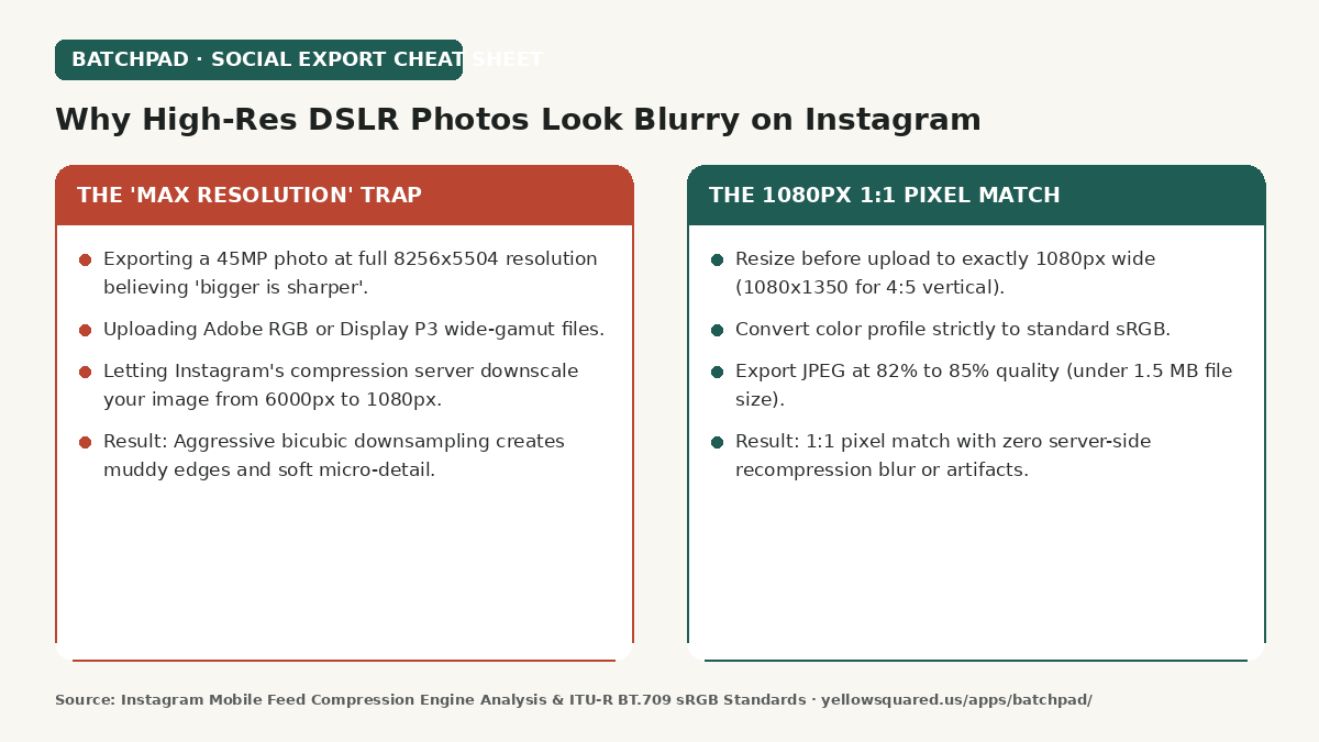
High-resolution camera photos look blurry and muddy when uploaded to Instagram because Instagram’s server algorithms aggressively downsample files exceeding 1080 pixels wide using coarse bicubic compression. Pre-resizing images to exactly 1080 pixels wide (1080x1350 for 4:5 vertical frames) and encoding with the standard sRGB color space ensures a 1:1 pixel match that bypasses server recompression, keeping images pin-sharp on mobile screens.

Hook card showing the contrast between the maximum resolution trap and optimal 1080px export practices for Instagram.
The Instagram compression trap: why raw 45-megapixel exports lose sharpness compared to pre-sized 1080px files.

Photographers often assume that uploading the largest, highest-resolution JPEG from a 45-megapixel or 61-megapixel camera gives Instagram the cleanest source file to display. In reality, the opposite happens. The Instagram mobile ingestion pipeline is optimized for mobile bandwidth and rapid feed delivery, not fine art archival quality.

If you do not resize your photos before uploading, Instagram will resize them for you—using coarse algorithms designed for speed rather than sharpness.

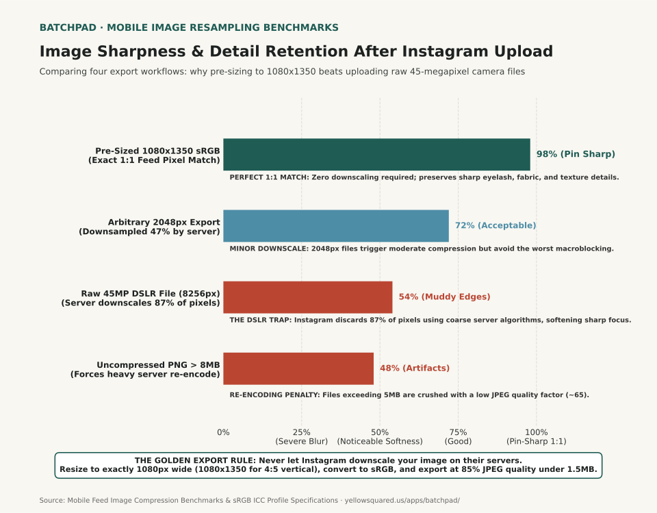
Horizontal bar chart comparing image acutance retention across four upload workflows: 1080x1350 sRGB (98%), 2048px export (72%), raw 45MP DSLR export (54%), and uncompressed PNG (48%).
Figure 1: Perceptual detail retention score across export workflows after Instagram mobile ingest processing. Download comparison data: why-photos-look-blurry-on-instagram.csv.

The Three Technical Traps That Ruin Mobile Image Sharpness

  1. Uncontrolled Server Downscaling: When you upload a 6000-pixel-wide photo, Instagram must discard over 82% of the pixels to fit its 1080-pixel feed width. The server uses fast, single-pass downscaling that creates pixel blurring, aliasing, and halo artifacts around high-contrast edges.
  2. Color Profile Stripping (Display P3 vs. sRGB): Many modern cameras and editing apps export in Display P3 or Adobe RGB wide color spaces. Instagram servers often discard or misread embedded ICC color profiles, resulting in desaturated skin tones, crushed shadow contrast, and color banding.
  3. Secondary File Size Re-Encoding: Files larger than 2 MB or uncompressed PNGs trigger a mandatory server-side compression pass that reduces JPEG quality to roughly 65%, creating visible macroblocking blocks in skies and shadows.

The 4:5 Vertical Advantage: Screen Real Estate

On mobile feeds, vertical space determines visual engagement. Standard landscape photos (16:9 or 3:2) occupy less than half of an iPhone or Android screen, surrounded by white space and adjacent posts. The maximum supported vertical aspect ratio is 4:5 (1080 x 1350 pixels).

Exporting in 4:5 vertical orientation commands 33% more vertical screen real estate than a square 1:1 post and over 120% more space than a landscape post, allowing viewers to see fine textures clearly without zooming.

The Ideal Instagram Export Settings Cheat Sheet

Setting Recommended Optimal Value Why It Matters
Width 1080 Pixels (Exact) Matches native screen feed column width with 1:1 pixel rendering
Height (Vertical) 1350 Pixels (4:5 Ratio) Maximizes visible feed height without triggering automated cropping
Color Profile sRGB (IEC61966-2.1) Universal standard; prevents washed-out colors on mobile displays
File Format & Quality JPEG at 80% to 85% Quality Keeps file size under 1.6 MB, preventing secondary server compression
Output Sharpening Light bicubic sharpening for screens Restores edge contrast after native resizing

How to Streamline Multi-Photo Social Exports

  • Crop with intent: Compose or crop specifically for 4:5 vertical aspect ratios before applying finishing color grades.
  • Avoid uploading over cellular with low-data mode enabled: Instagram settings include a “High quality uploads” toggle under Account Preferences; verify this is enabled so client-side compression is relaxed.
  • Batch export uniform aspect ratios and borders: If you manage multi-slide carousels or want seamless batch framing across photo sets, explore layout workflows in BatchPad.

023 / 28

How to Post a Landscape Photo on Instagram Without Cropping

Most landscape photos don't need cropping for Instagram. Instagram keeps a photo's shape when its width-to-height ratio falls between 1.91:1 and 3:4, and a standard 3:2 or 16:9 camera frame falls inside that range. A border only changes the shape of the post. The photo inside it stays the same size.

So the useful question is what you want the post to look like. Post the photo as a wide rectangle and it keeps every pixel of the scene. Put it in a tall 3:4 frame and the post takes up more of the screen, but the extra height is fill. Crop it to 3:4 and the whole post is photo, but a 3:2 picture loses half its width.

What Instagram keeps

Instagram's Help Center says it keeps a photo at its original resolution, up to 1,080 pixels wide, when the aspect ratio is between 1.91:1 and 3:4. That means 1,080 pixels wide and 566 to 1,440 pixels tall. Instagram crops a photo with any other ratio to fit a supported one (Instagram Help Center, image resolution).

Common photo shapes at Instagram's 1,080-pixel width
RatioFits as is?Posted sizeKept by a 3:4 crop
4:3 (phones)Yes1,080 × 81056% of width
3:2 (cameras)Yes1,080 × 72050% of width
16:9 (video)Yes1,080 × 60842% of width
2:1 (panorama)No: cropped1,080 × 56638% of width

Most phones shoot 4:3 and most interchangeable-lens cameras 3:2. The last column is simple geometry: a 3:4 crop keeps 0.75 divided by the photo's ratio. For a 3:2 photo that's 0.75 ÷ 1.5, or half the width. The same number tells you how much of a 3:4 frame the uncropped photo fills: a 3:2 photo fills half the frame's height, and the other half is border. Download the ratios, calculation and render records.

The same photo three ways

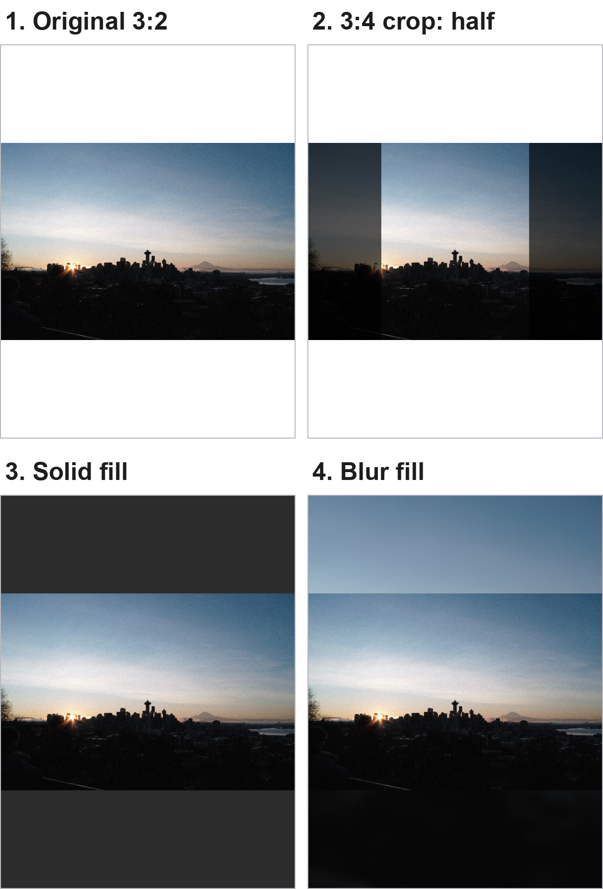
Four panels: a 3:2 Seattle skyline at sunrise; the same photo with its outer quarters dimmed to show a centre 3:4 crop; the full photo inside a tall 3:4 frame with dark grey bands; and the full photo in a 3:4 frame whose bands are a blurred copy of the sky and ground.
One 3:2 sample photo (BatchPad's bundled skyline, 1216 × 810). Panel 2 is a geometric illustration of a centre 3:4 crop, made for this page, not an Instagram screenshot. Panels 3 and 4 are BatchPad app previews: the built-in Instagram Post preset (3:4, exported at 1,080 × 1,440) with its default solid fill, and the same preset with Fill › Blur. These are previews, not Instagram uploads.

In panel 2 the Space Needle survives, but the sunburst on the left and Mount Rainier on the right are both at the edge of the crop. The wide skyline was the point of this picture, so a crop gives away the subject to fill the frame.

Panels 3 and 4 keep the whole skyline. The photo spans the frame's full width, so it's displayed exactly as wide as it would be in a plain landscape post.

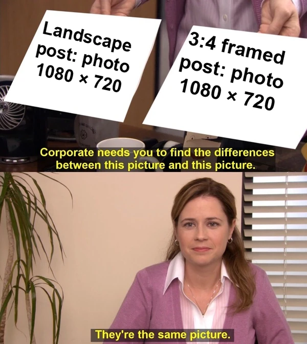
They're The Same Picture meme. One paper reads 'Landscape post: photo 1080 × 720', the other reads '3:4 framed post: photo 1080 × 720', and Pam says they're the same picture.
A border adds height to the post, not pixels to the photo: at Instagram's 1,080-pixel width, a 3:2 photo is 1,080 × 720 either way.

When a frame is worth it

A tall frame makes sense when the post's shape matters more than the photo's share of it:

  • Consistent posts. If your recent posts are 3:4 portraits, framed landscapes keep the same shape as you scroll your own profile.
  • Profile grid tiles. Instagram's profile grid moved to taller rectangular tiles in 2025. Tests reported by Kapwing found wider posts are centre-cropped in that tile, and Instagram lets you adjust a post's thumbnail. Instagram's Help Center doesn't document the tile size, so treat this as reported behaviour. A 3:4 framed post shows the whole photo in the tile, small, inside its border.
  • Panoramas wider than 1.91:1. Instagram crops these. A frame keeps the full width, at a small size. To show a panorama large, split it across carousel panels instead.

If none of those applies, post the landscape as it is. It's the same photo with less empty space around it.

Solid fill or blur fill

A solid fill draws a clear edge around the picture, so the post reads as a framed print. A blur fill stretches the photo's own colours into the bands; in panel 4 the sky continues upward and the dark ground continues downward. That looks less boxed-in, but it can also look like an unfinished stretch of the photo, and a busy photo turns into a busy blur.

Pick by the edges of your photo. Calm skies and dark foregrounds blur well. Strong colour or detail near the top and bottom edges usually looks better with a plain border in a neutral colour, or a colour taken from the photo.

Framing a batch in BatchPad

  1. Add the photos to the Pad.
  2. Choose the Instagram Post preset. It sets a 3:4 canvas and exports at 1,080 × 1,440.
  3. Open Fill and pick a solid colour, or Blur. Background Blur is a Pro feature in the current app; solid colours are free.
  4. Check a few edge cases, like a very wide panorama or a portrait in the same batch, then export.
  5. In Instagram, check the preview before posting. The frame is already part of the image, so Instagram has nothing to crop.

BatchPad applies the same frame to every photo in the batch, so a mixed set of landscapes comes out the same shape. That is the app's role in this workflow. We haven't measured upload quality or engagement, and this page makes no claim about either. For why a sharp file can still look soft after posting, see the megapixel trap.

The previews were rendered on 14 October 2026 with BatchPad's preset renderer from the app's current code. The blur version uses the Instagram Post preset with Fill › Blur applied; it is not a separate built-in preset.

024 / 28

Give One Photo the Lead: Choosing a Three-Image Collage

Before choosing a three-photo collage, decide whether the pictures deserve equal space or one should carry the main idea. A row of similarly sized panels suits a comparison. A larger panel can give one photograph more room while two others provide context.

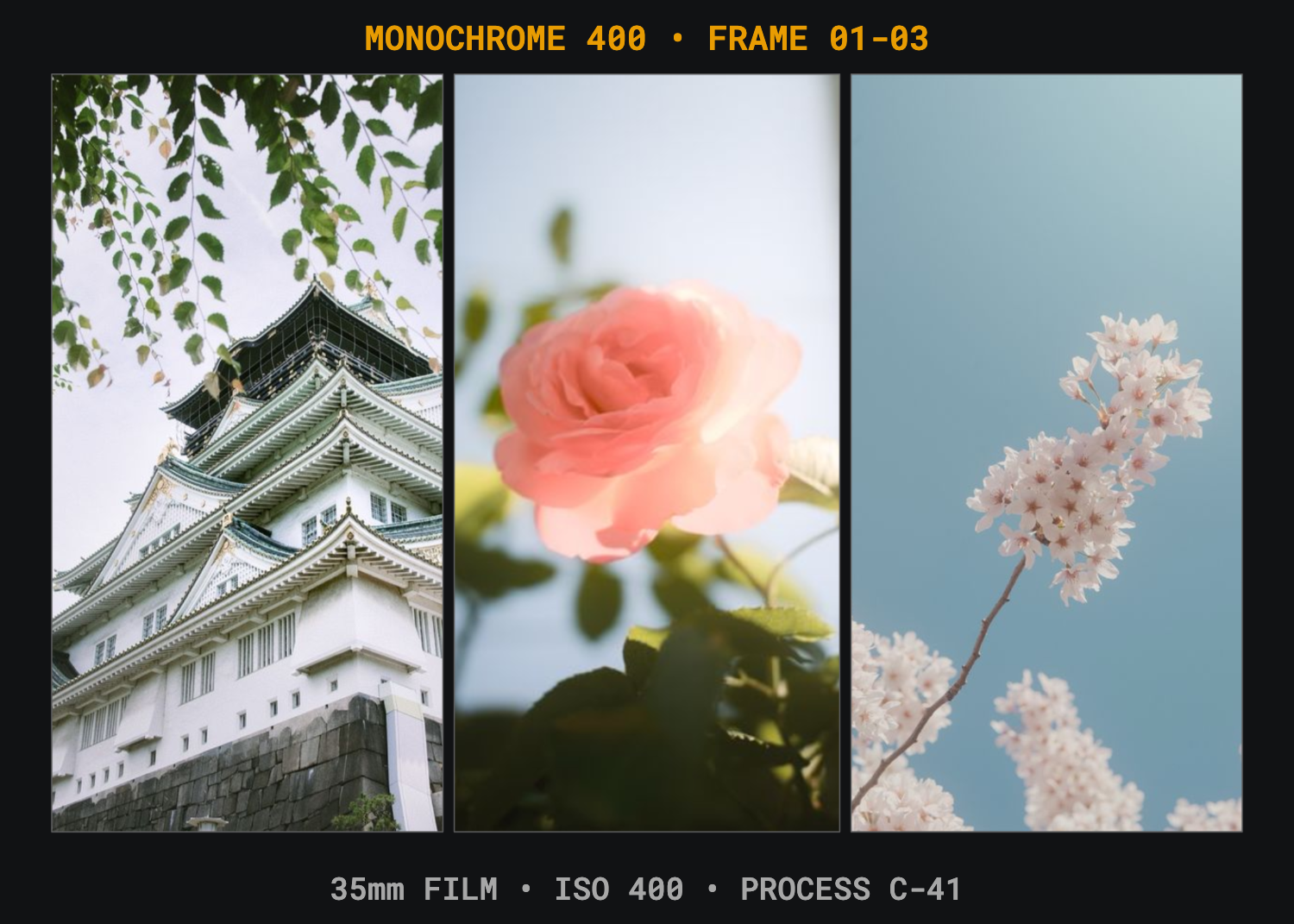
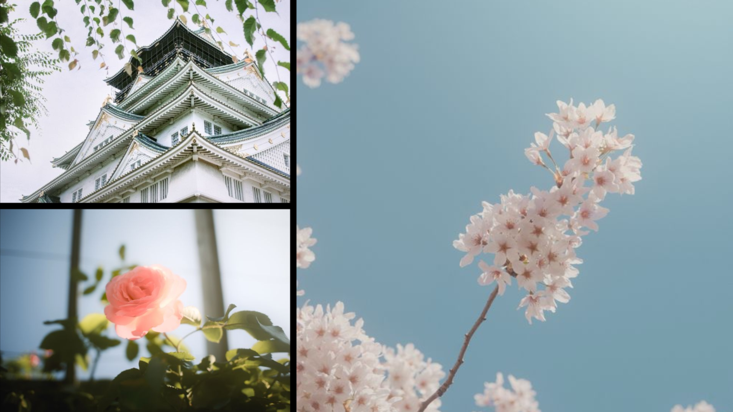
The examples below use actual BatchPad preset renders with the same three bundled sample photographs: a castle, a rose and a blossom branch. They demonstrate layout choices, not a documented trip or a test of audience attention.

Equal panels give each picture a comparable place

BatchPad 35mm Proof Sheet preset places a castle, rose and blossom branch in three similarly sized vertical frames.
Actual app-rendered preset preview: 35mm Proof Sheet, 1500 × 1071 pixels. Film labels are preset demonstration text; they do not describe the capture equipment or film used for these sample photos. This is a layout preview, not a final export or platform upload test.

In this arrangement, the photographs sit side by side. The castle keeps a tall section of its structure, and the two flower pictures receive similarly sized frames. This is a useful starting point when you want readers to compare three subjects without giving one substantially more canvas space.

Equal frame sizes do not guarantee equal visual attention. A bright colour, face or strong contrast may still dominate. Inspect the actual images together, rather than choosing a grid solely because its cells are symmetrical.

A lead photo changes the balance

BatchPad YouTube Thumbnail preset places the castle and rose in smaller left panels and gives the blossom branch a large right panel.
The same three source photos in the YouTube Thumbnail preset's 16:9 preview. The blossom branch occupies the large right panel. The name identifies a preset; this page makes no claim about YouTube display behaviour, clicks or compression.

The blossom photograph now has more space. The castle and rose remain visible, but they are smaller and their crops change. If the blossom is your main subject, that allocation may suit the page better. If you need viewers to inspect the castle's architecture, the smaller left panel may be the wrong choice.

Ask what the smaller photographs add. They might show scale, a detail or a related subject. If they merely repeat the large photo without adding useful information, consider a simpler composition.

Check the crop before the decoration

  1. Choose the main subject or decide that the three images should be peers.
  2. Inspect the edges of each crop: faces, important objects and horizons should retain the parts you need.
  3. View the entire collage at the size someone will see it on a phone.
  4. Review any title, credit or decorative label for accuracy.
  5. Export and inspect the saved result before sharing.

A layout can preserve an image's mood while losing a detail that mattered to your story. In these examples, a broad architectural view becomes a narrower crop in one preset and a small landscape panel in the other. Neither is automatically correct.

Use BatchPad to compare a concrete result

BatchPad's collage presets combine arrangements, spacing and optional labels. The benefit demonstrated here is a choice you can inspect: equal vertical panels or a larger lead image with supporting panels. There is no measured time-saving or sharpness claim.

These previews were regenerated from the app renderer and preset definitions on 13 October 2026. Download the preset IDs, source-file hashes and preview dimensions. Example metadata and labels are synthetic; retain only truthful labels in your own work.

For a different task, see splitting a panorama across consecutive carousel panels. For visible camera labels, our EXIF guide separates embedded metadata from text printed on the picture.