YellowSquared  /  Field notes

Notes from the workshop

28 posts, newest first. Choose an app to narrow the feed.

001 / 28

What Is the Difference Between Nearest-Neighbor, Bilinear, Bicubic, and Lanczos Image Resizing?

Export a 24-megapixel camera raw file (6000 × 4000 pixels) down to a 1080 × 1350 social frame or upscale a retro game sprite, and your image editor asks you to pick a resampling filter: Nearest-Neighbor, Bilinear, Bicubic, or Lanczos. Why does one setting leave diagonal lines jagged, another make eyelashes look muddy, and a third keep fine fabric texture crisp? As explained in digital signal processing references on two-dimensional image scaling, bicubic spline convolution, and Lanczos windowed-sinc resampling, every resizing algorithm is a 2D reconstruction kernel defined by how many neighboring pixels it samples (1×1 up to 6×6) and whether its mathematical curve includes negative side lobes to preserve edge contrast.
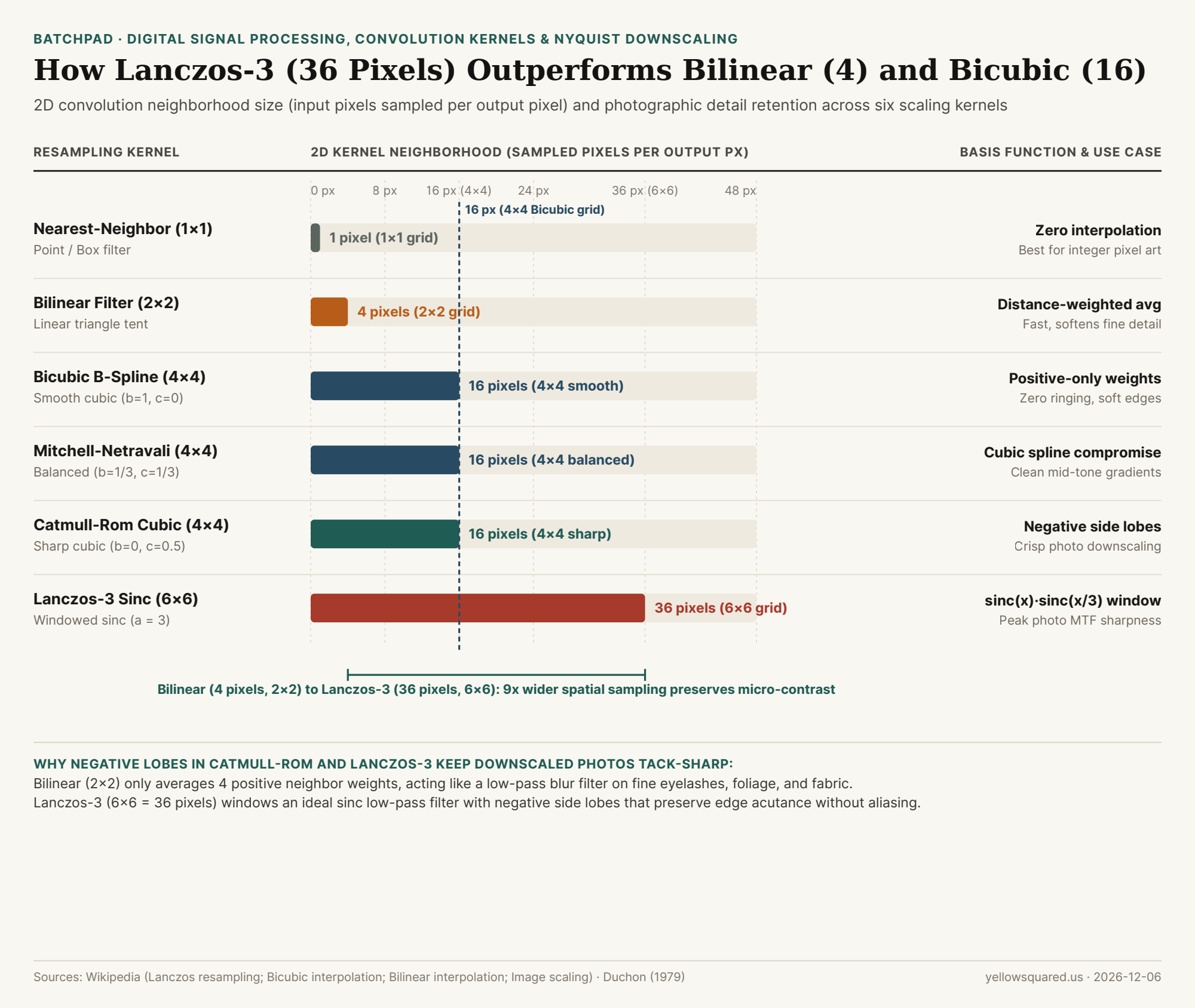
Chart comparing 2D pixel neighborhood sample counts across Nearest-Neighbor, Bilinear, Bicubic B-Spline, Mitchell-Netravali, Catmull-Rom, and Lanczos-3 image resizing algorithms
Figure 1: 2D convolution kernel neighborhood size (input pixels sampled per output pixel) and basis functions across six standard image resampling algorithms. Data: Wikipedia (Lanczos resampling), Bicubic interpolation, and Bilinear interpolation (download CSV).

From 1 Pixel to 16 Pixels: Nearest-Neighbor (1×1), Bilinear (2×2), and Bicubic (4×4)

When an image is scaled to a new pixel grid, output pixel centers rarely land squarely on input pixel centers. To calculate the RGB value at fractional coordinate (x, y), the resampler applies a 1D kernel horizontally and vertically across a square neighborhood of surrounding input pixels:

  • Nearest-Neighbor Interpolation (1×1 = 1 Pixel, Box Filter): Instead of blending colors, Nearest-Neighbor simply copies the single closest input pixel. For pixel art, QR codes, and UI screenshots scaled by exact integer multiples (200%, 300%, 400%), Nearest-Neighbor is unbeatable because it introduces zero anti-aliasing blur. On continuous-tone photographs or non-integer ratios, however, it produces severe staircase "jaggies" and moiré aliasing.
  • Bilinear Interpolation (2×2 = 4 Pixels, Tent Filter): Computes a linear distance-weighted average of the 4 nearest pixels (2×2 grid). Because all weights are strictly positive and slope linearly to zero, Bilinear is fast enough for real-time GPU texture mapping, but acts as a heavy low-pass blur filter when downscaling high-resolution photography.
  • Bicubic Interpolation (4×4 = 16 Pixels, Cubic Polynomial Family): Evaluates a 4×4 grid of 16 surrounding pixels using third-degree piecewise cubic polynomials. Crucially, "Bicubic" is not a single curve—as formalized by Don Mitchell and Arun Netravali (1988), two parameters (b, c) tune the cubic filter between three famous presets:
    1. Bicubic B-Spline (b = 1, c = 0 — "Bicubic Smoother"): Uses 100% positive weights across all 16 pixels, suppressing noise and eliminating halo artifacts at the cost of softer edges.
    2. Mitchell-Netravali (b = 1/3, c = 1/3 — Balanced Standard): The mathematical sweet spot between blurring and ringing used by many graphics pipelines.
    3. Catmull-Rom Spline (b = 0, c = 0.5 — "Bicubic Sharper"): An exact interpolating cubic spline whose outer ring of pixels carries negative weights (around -0.0625), acting as a built-in micro-contrast sharpener during downscaling.

"In signal processing, an ideal Nyquist low-pass filter is an infinite sinc(x) = sin(πx)/(πx) wave; Lanczos-3 truncates that infinite wave to a 6×6 grid of 36 pixels using a second sinc window, delivering the highest photographic sharpness."

Why Lanczos-3 (6×6 = 36 Pixels) Is the Gold Standard for Photographic Downscaling

By the Nyquist-Shannon sampling theorem, the theoretically perfect filter for reconstructing or band-limiting a discrete image without losing sharpness is the normalized sinc(x) = sin(πx) / (πx) function. Because a pure sinc wave ripples outward to infinity (causing severe Gibbs phenomenon "ringing" halos across an entire image), meteorologist Claude Duchon (1979) applied mathematician Cornelius Lanczos's sigma approximation: multiplying the primary sinc(x) wave by a single central lobe of a stretched sinc(x / a) window over -a < x < a (Lanczos resampling):

  • Lanczos-2 (a = 2, 4×4 = 16 Pixels): Clips the kernel at the second zero-crossing (one positive central lobe plus one negative side lobe on each side), keeping ringing below 1%.
  • Lanczos-3 (a = 3, 6×6 = 36 Pixels): Evaluates 36 neighboring pixels (6×6 footprint) with a central positive lobe, a negative first ring, and a small positive outer ring. As computer graphics pioneer Jim Blinn noted, Lanczos-3 preserves low-frequency tonal structure and rejects high-frequency aliasing better than any other finite convolution filter—making it the default high-quality resampler in Pillow (Image.Resampling.LANCZOS), ImageMagick, and FFmpeg. Its only caveat is on synthetic line art or high-contrast white-on-black text, where the negative lobe can create a faint 1-pixel bright or dark halo ("ringing").
Resampling Algorithm 2D Grid Size Sampled Pixels Mathematical Basis Negative Lobes? Ideal Photographic / Design Use Case
Nearest-Neighbor 1 × 1 1 px Box / Point filter No Pixel art, retro sprites & integer UI scaling
Bilinear 2 × 2 4 px Linear tent filter No Real-time GPU previews; too soft for final exports
Bicubic B-Spline 4 × 4 16 px Cubic (b=1, c=0) No Upscaling noisy gradients without haloing
Mitchell-Netravali 4 × 4 16 px Cubic (b=1/3, c=1/3) Mild Balanced general-purpose image scaling
Catmull-Rom Bicubic 4 × 4 16 px Cubic (b=0, c=0.5) Yes (1 ring) Crisp downscaling ("Bicubic Sharper" behavior)
Lanczos-3 (a = 3) 6 × 6 36 px sinc(x)·sinc(x/3) Yes (2 lobes) Gold-standard downscaling for camera raw/JPEGs

How to Resize and Pad Camera Photos Without Losing Edge Acutance

When preparing a batch of 24MP or 45MP camera exports for Instagram carousels (1080 × 1350) or web galleries, high-order resampling (Lanczos-3 or sharp Bicubic) combined with clean aspect-ratio padding keeps fine eyelashes, foliage, and architectural lines crisp without double-scaling artifacts. Resize and pad high-resolution photos in BatchPad to export publication-ready frames locally on your device.
002 / 28

What Is the Difference Between sRGB, Display P3, and Adobe RGB, and Why Do Wide-Gamut Photos Look Washed Out on the Web?

Every photographer has experienced the export shock at least once: you spend an hour grading a sunset portrait or vibrant foliage frame in Lightroom or Capture One, export a JPEG for a client gallery or social feed, and the moment you open the uploaded image in a browser or messaging app, the glowing oranges turn muddy peach and the emerald greens look pale and lifeless.

The culprit is almost never your monitor calibration—it is a mismatch between the color space triangle in which your pixel numbers were encoded and the color space assumed by the viewing app. By comparing the standardized CIE 1931 chromaticity coordinates of sRGB, Display P3 (DCI-P3), and Adobe RGB (1998) across RGB color spaces, you can pick the exact right container for editing, printing, and web delivery. When framing and exporting multi-image sets for social carousels or print portfolios, you can Batch-pad and frame high-DPI print canvases in BatchPad with clean color-managed output.

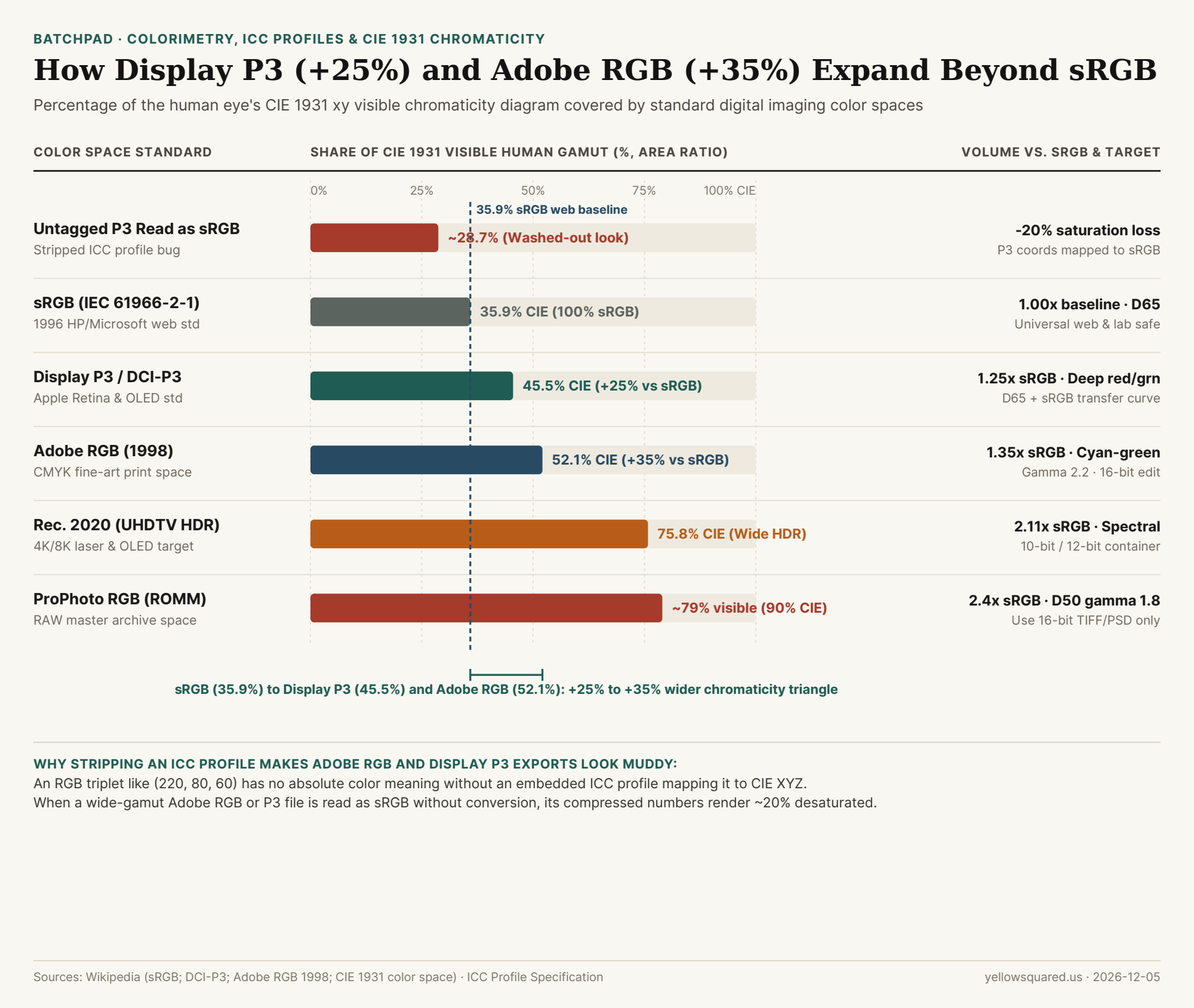
Horizontal bar chart comparing CIE 1931 visible human color gamut coverage percentage across untagged P3 read as sRGB (28.7%), sRGB (35.9%), Display P3 (45.5%), Adobe RGB (52.1%), Rec. 2020 (75.8%), and ProPhoto RGB (79.0%).
Figure 1: Percentage of the CIE 1931 xy visible human chromaticity diagram covered by standard digital color spaces, alongside the ~20% saturation loss when a wide-gamut file is misread as sRGB. Source: Wikipedia (RGB color spaces), sRGB, DCI-P3, and Adobe RGB (1998).

How sRGB (35.9%), Display P3 (45.5%), and Adobe RGB (52.1%) Divide the Visible Spectrum

In 1931, the International Commission on Illumination (CIE) mapped every color visible to the human eye onto a horseshoe-shaped xy chromaticity diagram. Any additive RGB color space defines three primary anchor points—Red (x_R, y_R), Green (x_G, y_G), and Blue (x_B, y_B)—forming a triangle inside that horseshoe. A display or file can only represent colors that fall inside its triangle:

  • sRGB (IEC 61966-2-1, 1996 — 35.9% of CIE 1931): Co-developed by Hewlett-Packard and Microsoft in 1996 to match the phosphor limits of 1990s CRT monitors (Rec. 709 primaries with a D65 / 6500K white point and a ~2.2 piecewise transfer curve). While sRGB covers only 35.9% of the CIE 1931 diagram, it remains the universal default of the World Wide Web, Android/Windows UI layers, and commercial mini-lab photo printers (such as Fujifilm Frontier and Noritsu wet labs).
  • Display P3 (2010–2015 — 45.5% of CIE 1931, +25% Larger Than sRGB): Created by Apple by combining the theatrical DCI-P3 wide-gamut primaries with a standard D65 (6500K) white point and the familiar sRGB transfer function (gamma curve). Display P3 covers 45.5% of CIE 1931—giving you a 25% larger color gamut volume than sRGB, concentrated heavily in deep crimson reds, neon oranges, and vibrant spring greens on modern iPhones, iPads, Macs, and OLED screens.
  • Adobe RGB (1998) (52.1% of CIE 1931, +35% Larger Than sRGB): Engineered by Adobe in 1998 to encompass the cyan-green ink gamut of commercial CMYK offset presses and 10-ink fine-art pigment printers. Notice that Adobe RGB and Display P3 use the exact same Blue primary (x=0.15, y=0.06), but push in different directions: Adobe RGB reaches much further into cyan-greens (y_G = 0.71 vs. 0.69 in P3), whereas Display P3 reaches further into saturated red-oranges (x_R = 0.68 vs. 0.64 in Adobe RGB).
  • ProPhoto RGB (ROMM RGB — ~79% Visible / 90% CIE 1931): Used internally by Adobe Lightroom's Develop module (with a D50 white point and 1.8 gamma) so zero highlight or shadow color is clipped during RAW processing. Its triangle is so huge that ~13% of its coordinates represent "imaginary colors" outside human vision—meaning you must never export an 8-bit JPEG in ProPhoto RGB, or stretching 256 steps across that massive span will cause severe sky banding.

"An RGB pixel value like (230, 65, 45) is just a relative percentage of a color space's primaries: strip the ICC profile off an Adobe RGB or Display P3 image, and any sRGB viewer will map that number to a 20% duller primary—draining the life out of skin tones and sunsets."

Why Untagged Wide-Gamut Photos Look Washed Out (The Coordinate Compression Trap)

Why does an Adobe RGB or Display P3 photo look less saturated than an sRGB photo when viewed in a non-color-managed app or when an upload pipeline strips its ICC metadata tag? It seems backward until you trace the math:

Suppose a moderately warm skin tone sits at the exact outer edge (100%) of the sRGB red primary (R = 255 in sRGB). Because the Display P3 and Adobe RGB triangles extend 25% to 35% further outward than sRGB, that exact same physical skin tone sits only ~80% of the way to the outer edge of the wider triangle—so the wide-gamut file records it as a lower number (e.g., R = 208 instead of R = 255). As long as the file carries its embedded ICC profile (~500 bytes for Display P3 or Adobe RGB), a color-managed browser reads R = 208 in P3 and translates it correctly. If the ICC profile is stripped or ignored, the browser assumes the file is sRGB and renders R = 208 at 80% of the narrow sRGB primary—shrinking your effective color gamut down to ~28.7% of CIE 1931 and making the entire photo look gray and washed out!

Color Space Standard CIE 1931 xy Share Size vs. sRGB White Point & Gamma Safe Bit Depth Best Production Use Case
Untagged P3/Adobe on sRGB ~28.7% (Compressed) 0.80x (-20% chroma) Mismatched primaries Broken in 8-bit What happens when an export strips the ICC profile
sRGB (IEC 61966-2-1) 35.9% 1.00x (Baseline) D65 · ~2.2 piecewise 8-bit / 16-bit Universal web delivery, client proofing, standard labs
Display P3 (DCI-P3 D65) 45.5% 1.25x (+25% wider) D65 · sRGB curve 8-bit / 10-bit iOS/macOS apps, modern web galleries (with ICC tag)
Adobe RGB (1998) 52.1% 1.35x (+35% wider) D65 · Pure 2.2 gamma 16-bit preferred Fine-art pigment inkjet printing & CMYK prepress
Rec. 2020 (BT.2020) 75.8% 2.11x (+111% wider) D65 · PQ / HLG HDR 10-bit / 12-bit 4K/8K HDR video mastering and OLED Cinema
ProPhoto RGB (ROMM) ~79.0% (90% CIE) 2.40x (+140% wider) D50 · 1.8 gamma 16-bit mandatory Internal RAW editing & 16-bit master TIFF archiving

The Three-Rule Color Workflow for Photographers

To keep your colors identical from camera sensor to final delivery: (1) edit your RAW files in a 16-bit wide working space (ProPhoto RGB or Adobe RGB) so you never clip channel highlights; (2) export 16-bit Adobe RGB TIFFs only when sending files to a fine-art pigment printer (Epson SureColor or Canon imagePROGRAF); and (3) explicitly convert to sRGB (or Display P3 with Embed ICC Profile checked) when exporting 8-bit JPEGs for the web. To frame, pad, and export entire client galleries without losing resolution or color fidelity, Batch-pad and frame high-DPI print canvases in BatchPad.

003 / 28

Why Is 300 PPI the Standard for Photo Printing, and How Does Viewing Distance Change Required Megapixels?

Open any commercial print-lab specification sheet or export preset and you will see the same universal rule: export files at 300 PPI (pixels per inch). Yet when photographers multiply 300 PPI by the dimensions of a large 24 × 36 inch gallery poster (7200 × 10800 px = 77.8 megapixels) or a 40 × 60 inch wall mural (12000 × 18000 px = 216 megapixels), they panic and assume their 24 MP or 45 MP full-frame camera cannot print large without turning into a blurry mosaic.

In reality, the 300 PPI benchmark is not a fixed law of ink on paper—it is a single point on an inverse trigonometric curve governed by viewing distance and the angular resolution of the human fovea. As demonstrated in psychophysical vision research from the University of Cambridge on the resolution limit of the human eye and optical engineering guides from RED Digital Cinema, once you step back to a comfortable viewing distance proportional to the frame size, a huge 24 × 36 inch poster or a 16 × 24 foot highway billboard requires no more total megapixels than an 8 × 12 inch handheld print (~8.6 to 12 MP). When preparing exhibition prints, editorial book plates, or padded gallery borders, you can Batch-pad and frame high-DPI print canvases in BatchPad with exact pixel dimensions tailored to your target viewing distance.

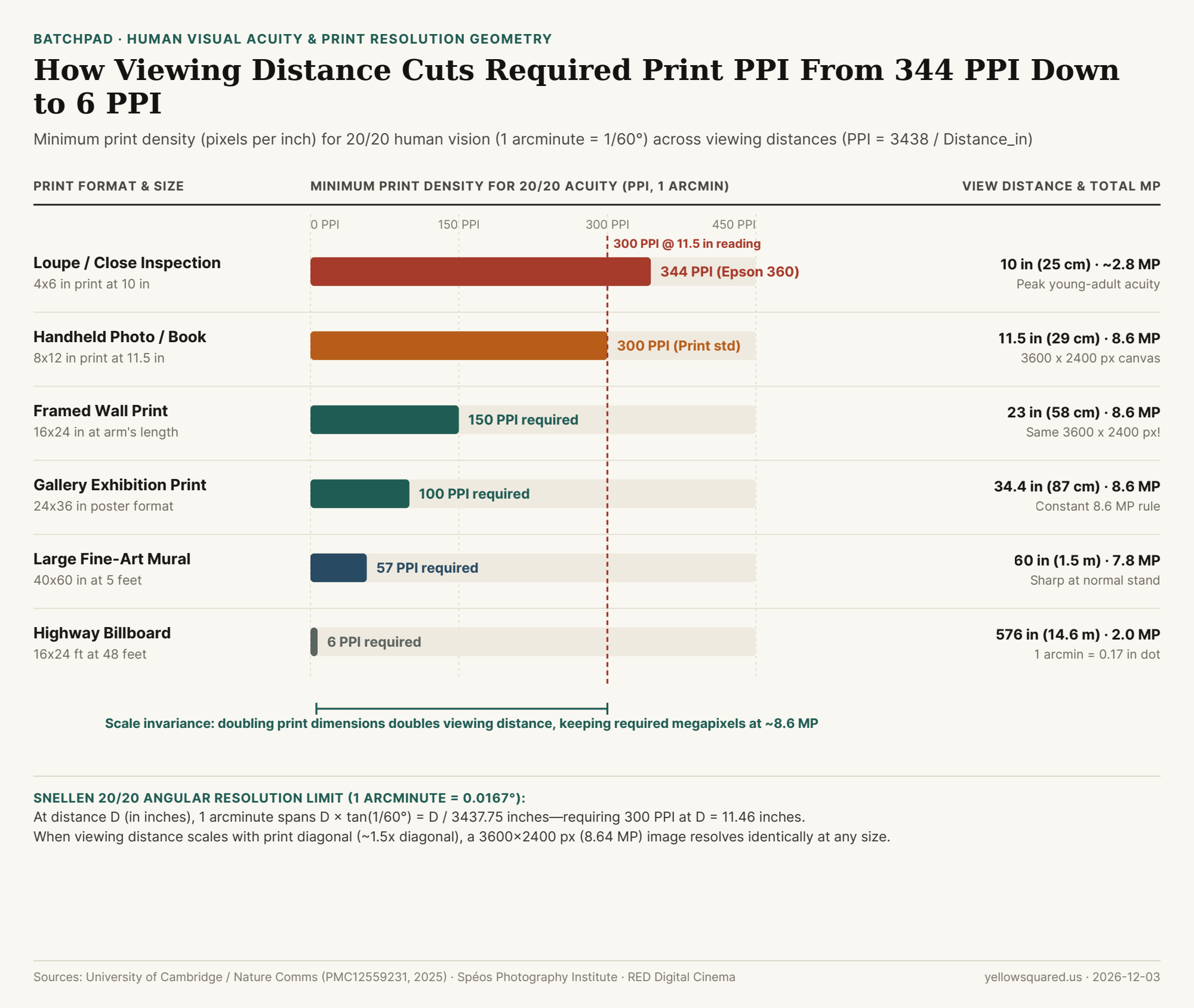
Horizontal bar chart showing minimum required print density in PPI across six viewing distances from 10 inches (344 PPI) to 48 feet (6 PPI).
Figure 1: Minimum print density (PPI) required for 20/20 human visual acuity (1 arcminute = 1/60°) across six print formats and viewing distances. Source: University of Cambridge / Nature Communications (PMC12559231), Spéos Photography Institute, and RED Digital Cinema.

The 1-Arcminute Trigonometry Behind 300 PPI

In ophthalmology and optical physics, standard 20/20 (6/6) Snellen visual acuity is defined as the ability to resolve a spatial cycle of one dark line and one white gap subtending 2 arcminutes of visual angle—meaning the smallest individual pixel or dot that the human eye can distinguish before adjacent dots blend into continuous tone subtends an angle of 1 arcminute (θ = 1/60° ≈ 0.01667° ≈ 0.00029089 radians).

Using basic right-triangle trigonometry at a viewing distance D (measured in inches from the observer's eye to the paper), the physical width s of a single 1-arcminute pixel on the print is:

s = 2 × D × tan(1 / 120°) ≈ D / 3437.75 inches

Taking the reciprocal (1 / s) gives the exact formula for the minimum print resolution (PPI) at which individual pixels become invisible to 20/20 vision at distance D:

Minimum PPI = 3437.75 / Viewing Distance (in inches)

Plug in a comfortable handheld reading distance of D = 11.46 inches (29.1 cm, or roughly one imperial foot) and the formula outputs 3437.75 / 11.46 = 300.0 PPI. As noted by the Spéos Photography Institute, young adults with peak contrast sensitivity at the closest comfortable near-point (D = 10 inches / 25 cm) can resolve up to 7 line pairs per millimeter (14 pixels/mm), which equals 344 to 356 PPI—the exact reason Canon and HP native print heads operate at 300 PPI while Epson piezo print heads operate at 360 PPI.

"Because comfortable viewing distance doubles whenever you double the diagonal of a print, the required PPI drops in half while the surface area quadruples—canceling out so that an 8.64-megapixel (3600 × 2400 px) file looks equally sharp at 8×12 inches, 16×24 inches, or 24×36 inches."

Why Scale Invariance Caps Required Resolution at ~8.6 to 12 Megapixels

Why don't billboards or gallery murals require hundreds of megapixels? Human vision has a comfortable sharp horizontal field of view of roughly 35° to 50°, which means viewers naturally stand at a distance equal to 1.0 to 1.5 times the diagonal of the artwork. For an 8 × 12 inch (3:2) print, the diagonal is √(8² + 12²) = 14.4 inches, and holding it at 0.8× diagonal (11.5 inches) requires 300 PPI:

(8 in × 300 PPI) × (12 in × 300 PPI) = 2400 × 3600 pixels = 8,640,000 pixels (8.64 MP)

Now double the linear dimensions to a 16 × 24 inch wall print (28.8-inch diagonal). A viewer standing at 23 inches (~2 feet) away only resolves 3438 / 23 = 150 PPI. Multiplying 16 in × 150 PPI by 24 in × 150 PPI yields the exact same 2400 × 3600 pixels (8.64 MP)! As detailed in Ashraf et al.'s Cambridge resolution-limit analysis, angular spatial frequency—measured in pixels per degree (PPD) at the retina, not pixels per inch on the wall—determines perceived sharpness.

Print Format & Aspect (3:2) Physical Dimensions Typical Viewing Distance 20/20 Acuity PPI Required Pixel Canvas Total Megapixels
Close Loupe / Fine Book Plate 4 × 6 in 10.0 in (25.4 cm) 344 PPI (Epson 360) 1376 × 2064 px 2.84 MP
Handheld Photo / Magazine 8 × 12 in 11.5 in (29.2 cm) 300 PPI (Canon/HP) 2400 × 3600 px 8.64 MP
Framed Wall Print (Arm's Length) 16 × 24 in 23.0 in (58.4 cm) 150 PPI 2400 × 3600 px 8.64 MP
Gallery Exhibition Poster 24 × 36 in 34.4 in (87.4 cm) 100 PPI 2400 × 3600 px 8.64 MP
Large Fine-Art Wall Mural 40 × 60 in 60.0 in (1.52 m) 57 PPI 2280 × 3420 px 7.80 MP
Highway Billboard 16 × 24 ft (192×288 in) 48.0 ft (14.6 m) 6 PPI 1152 × 1728 px 1.99 MP

When Do You Actually Need 24 MP, 45 MP, or 100 MP?

There is one exception where high-megapixel sensors (45 MP to 100 MP medium format) genuinely matter: gallery prints where viewers violate the proportional distance rule. In a museum or fine-art gallery, a viewer will first admire a 24 × 36 inch landscape from 3 feet away (100 PPI needed), and then walk right up to 11.5 inches to inspect fine foliage or eyelashes (300 PPI needed = 7200 × 10800 px = 77.8 MP).Adding a clean white mat border or editorial title margin also reduces the active image area on the paper, boosting effective PPI by 15% to 30%. Before sending your next portfolio batch to the printer, Batch-pad and frame high-DPI print canvases in BatchPad to add proportional gallery borders while preserving every native sensor pixel.

004 / 28

Instagram Image Sizes and Aspect Ratios: Why 4:5 (1080x1350) Takes Up 25% More Screen Space Than 1:1

On a mobile feed, width is fixed: Instagram clamps every post across the full width of the phone screen at a standard delivery resolution of 1,080 pixels wide (Instagram Image Size Guide 2026 - Buffer). Because horizontal width never changes, your image's aspect ratio is the single mathematical lever that controls how many vertical pixels—and how much physical screen real estate—your photograph occupies as a viewer scrolls (Instagram Post Size: 1080×1350 (4:5) - PostFast).

For photographers shooting on 3:2 full-frame or APS-C cameras (24×36 mm sensor geometry), uploading unpadded images forces an unpleasant choice between shrinking a horizontal shot to 1080×720 px or slicing 16.7% off a vertical portrait—a trade-off you can solve cleanly when you Pad and export crisp social carousels in BatchPad.

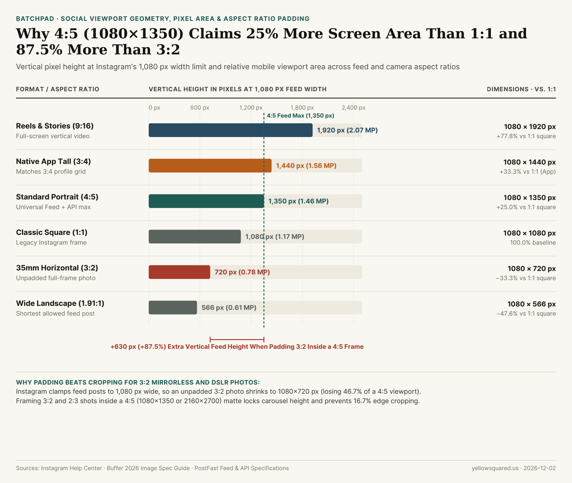
Chart comparing vertical pixel height at 1,080 px width and total pixel area across 9:16, 3:4, 4:5, 1:1, 3:2, and 1.91:1 Instagram formats
Figure 1: Vertical pixel height at Instagram's 1,080 px width ceiling and relative viewport area across feed and camera aspect ratios. Data: instagram-feed-aspect-ratios-1080x1350-4-5-vs-1080x1080-pixel-area-and-crop-loss.csv (Buffer 2026 Spec Guide; PostFast).

The 1,080-Pixel Width Rule: Exact Pixel Math Across Every Aspect Ratio

When Instagram's image pipeline ingests a photo wider than 1,080 px, it downscales the width to 1,080 px and sets the vertical height proportionally (H = 1080 × (height_ratio / width_ratio)) (Free Instagram Image Resizer & Size Guide - Buffer). Comparing every standard format against the classic 1:1 square (1,080 × 1,080 = 1,166,400 pixels) shows the exact viewport multiplier:

  • 1.91:1 Wide Landscape (1080 × 566 px = 611,280 px): The shortest aspect ratio Instagram allows without auto-cropping. It occupies just 52.4% of the screen area of a square post and 41.9% of a 4:5 portrait (Buffer 2026 Spec Guide).
  • 3:2 Full-Frame Horizontal (1080 × 720 px = 777,600 px): A native horizontal frame from a Nikon, Sony, Canon, or Fujifilm camera renders at 720 px tall—occupying 66.7% of a square post and losing 630 vertical pixels compared to 4:5.
  • 1:1 Classic Square (1080 × 1080 px = 1,166,400 px): The 100.0% baseline. Cropping a horizontal 3:2 photo to 1:1 discards 33.3% of your composition (1/3 of the horizontal sensor width).
  • 4:5 Standard Portrait (1080 × 1350 px = 1,458,000 px): At 1,350 px tall, 4:5 delivers +25.0% more vertical height and pixel area than a 1:1 square (+291,600 pixels) and +87.5% more height than an unpadded 3:2 horizontal photo (1350 / 720 = 1.875) (PostFast).
  • 3:4 Native App Tall Portrait (1080 × 1440 px = 1,555,200 px): Instagram's mobile app supports 3:4 uploads (+33.3% larger than 1:1, matching the updated 3:4 profile grid), whereas Meta's Graph API for third-party schedulers and feed ads caps vertical feed images at 4:5 (1080 × 1350 px) (PostFast).
  • 9:16 Reels & Stories (1080 × 1920 px = 2,073,600 px): Fills 177.8% of a square in the dedicated Reels and Stories tabs, but gets center-cropped in the main feed and profile grid.

"Because every Instagram feed post is locked to 1,080 pixels wide, switching your export canvas from 3:2 (720 px tall) to 4:5 (1,350 px tall) increases your vertical screen presence by 87.5%."

Why Mixed-Orientation Carousels Fail Without Aspect Ratio Padding

Instagram enforces a strict first-slide aspect ratio lock on every multi-photo carousel: whatever aspect ratio you choose for Slide 1 (1:1, 4:5, or 3:2) becomes the rigid crop box for Slides 2 through 20 (Buffer 2026 Spec Guide). If Slide 1 is a vertical 4:5 portrait (1080×1350) and Slide 2 is a horizontal 3:2 wide shot, Instagram slices 46.7% of the horizontal width off Slide 2 so it fits the vertical 4:5 box. Even on a single vertical 2:3 full-frame portrait (1080×1620), uploading directly to a 4:5 (1080×1350) frame crops 270 vertical pixels (16.7% of the image height) off the top and bottom.

Instagram / Camera Format Aspect Ratio Pixel Dimensions Total Pixel Area Area vs. 1:1 Square 3:2 / 2:3 Crop Loss
1. Reels & Stories Fullscreen 9:16 1080 × 1920 px 2,073,600 px 177.8% (+77.8%) −52.9% off 3:2 width
2. Native App Tall Portrait 3:4 1080 × 1440 px 1,555,200 px 133.3% (+33.3%) −11.1% off 2:3 height
3. Standard Feed Portrait 4:5 1080 × 1350 px 1,458,000 px 125.0% (+25.0%) −16.7% off 2:3 height
4. Classic Square Post 1:1 1080 × 1080 px 1,166,400 px 100.0% (Baseline) −33.3% off 3:2 width
5. Full-Frame Horizontal 3:2 1080 × 720 px 777,600 px 66.7% (−33.3%) 0.0% (Loses 630 px height)
6. Wide Landscape Limit 1.91:1 1080 × 566 px 611,280 px 52.4% (−47.6%) −21.4% off 3:2 height

How to Pad Mixed 3:2 and 2:3 Photos Into a Unified 4:5 (2160×2700) Carousel

Instead of letting Instagram's server crop your compositions or shrink your horizontal frames to 720 px tall, pad every image in your sequence onto a uniform 4:5 portrait canvas (1080 × 1350 px or 2x Retina 2160 × 2700 px) with clean gallery borders (#f9f7f1 warm paper, #ffffff studio white, or #141312 darkroom matte). That way, every slide in your carousel claims the full 1,350 px vertical viewport height while preserving 100% of your 3:2 horizontal and 2:3 vertical camera frames. To batch-frame mixed-orientation shoots with uniform borders and editorial title cards in seconds, Pad and export crisp social carousels in BatchPad.

005 / 28

Why Do Cameras Shoot in 3:2 While Phones Shoot in 4:3—And Why Do 8×10 Prints Cut Off the Edges of Your Photos?

Take a family portrait or landscape on a full-frame or APS-C mirrorless camera, upload the raw JPEG to a print lab to order a classic 8×10-inch framed print—or drop it into a vertical 4:5 (1080×1350) social post—and the crop preview immediately chops off 16.7% of your composition along the long edges. Take the exact same shot on an iPhone, Android phone, or medium-format GFX camera, however, and it drops into an 8×10 or 4:5 frame with barely a sliver (6.2%) trimmed away. Why do dedicated interchangeable-lens cameras shoot in a wider 3:2 (1.50:1) rectangle while smartphones, Micro Four Thirds, and digital medium-format backs shoot in a boxier 4:3 (1.33:1) rectangle—and why doesn't either one match an 8×10 frame? Surprisingly, both sensor shapes trace back to the exact same strip of 1890s 35mm motion-picture film.

Reader outcome: You will learn how Oskar Barnack rotated Thomas Edison's 18×24mm (4:3) movie frame by 90 degrees and doubled it into the 24×36mm (3:2) Leica frame in 1913, see the exact percentage of pixels lost across every print and social ratio, and learn how aspect-ratio border padding preserves 100% of your composition.

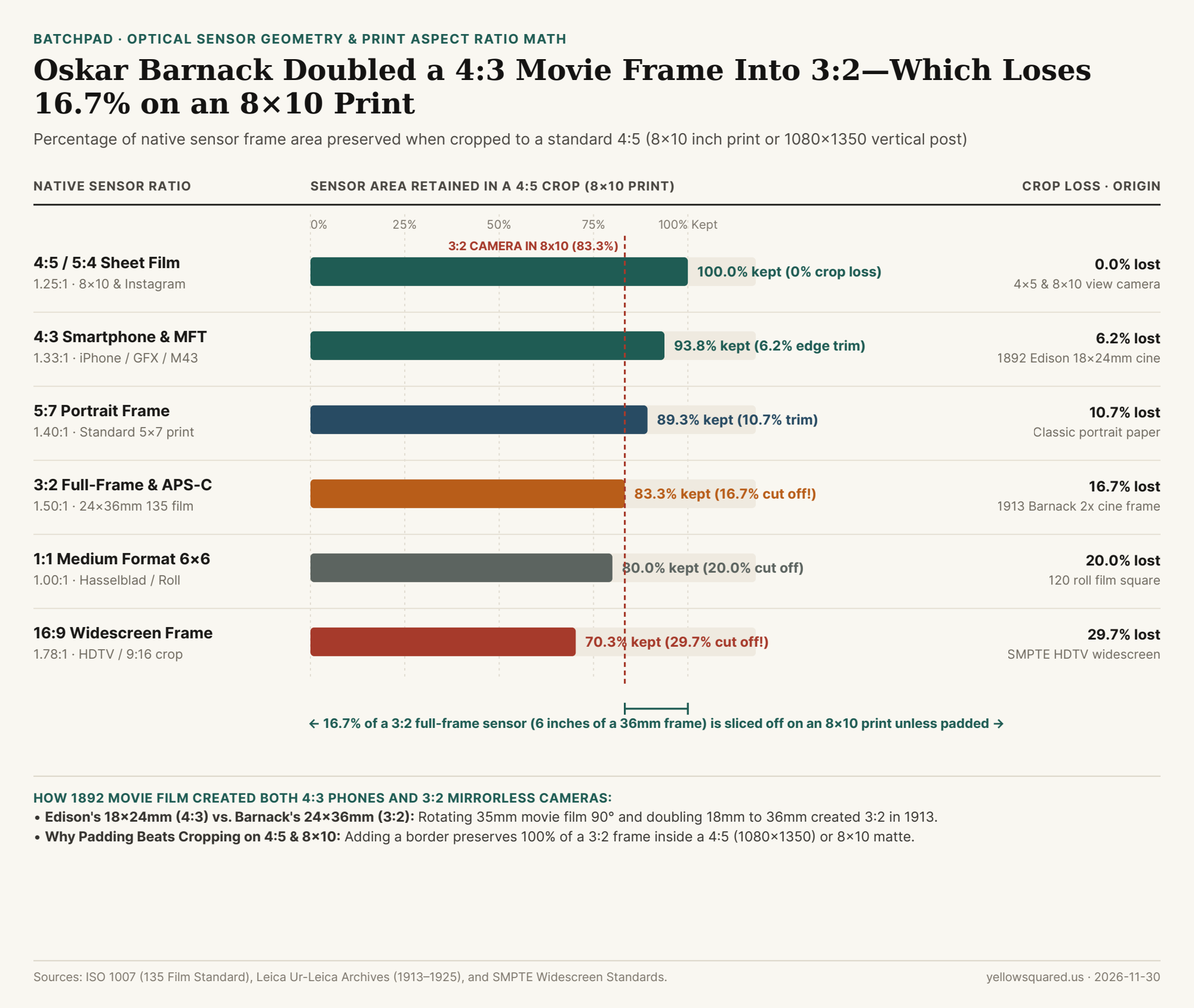
Chart comparing percentage of native sensor area preserved when cropping 4:5, 4:3, 5:7, 3:2, 1:1, and 16:9 images into an 8x10 print or 4:5 vertical frame
When fitted into a 4:5 (8×10 print or 1080×1350 vertical) container without border padding, a 4:3 smartphone sensor retains 93.8% of its frame, whereas a 3:2 full-frame or APS-C camera loses 16.7% (one-sixth) of its long dimension. Data: Download CSV dataset.

How One Strip of 35mm Cinema Film Created Both 4:3 and 3:2

In 1889–1892, William Kennedy Laurie Dickson working in Thomas Edison's laboratory slit Eastman Kodak's 70mm roll film in half to create 35mm perforated motion-picture film. Between the two rows of sprocket holes sat a usable image strip 24 mm wide. Running the film vertically through a movie camera at 4 perforations per frame yielded an image 18 mm tall by 24 mm wide:

24 mm ÷ 18 mm = 4 : 3 (1.33 : 1)

That 4:3 Edison silent-cinema ratio became the universal geometry of 20th-century visual displays: first Hollywood's Academy ratio, then analog cathode-ray tube (CRT) televisions, and then 1980s–1990s VGA/SVGA computer monitors (640×480, 1024×768). When early digital point-and-shoot cameras, the Olympus/Kodak Four Thirds standard, and camera-phone CMOS sensors were engineered in the 1990s and 2000s, chipmakers adopted 4:3 because it matched computer screens and maximized silicon area inside circular lens image circles.

Where, then, did 3:2 come from? Around 1913–1914, optical engineer Oskar Barnack at Ernst Leitz in Wetzlar, Germany built a compact still camera (the prototype Ur-Leica) to test batches of 35mm cinema stock. A single 18×24 mm movie frame was too small and grainy for high-quality still enlargements. So Barnack turned the 35mm film strip sideways (horizontally)—making the 24 mm inter-sprocket width the height of the still frame—and doubled the 18 mm cinema height to 36 mm (advancing 8 perforations per shot instead of 4):

36 mm ÷ 24 mm = 3 : 2 (1.50 : 1)

Kodak standardized Barnack's 24×36 mm "double-frame" cinema format in 1934 as 135 film (ISO 1007), and Canon, Nikon, Sony, Leica, and Fujifilm carried that exact 3:2 geometry into modern full-frame (36×24 mm) and APS-C (~23.5×15.6 mm) digital sensors.

A 4:3 smartphone photo is the shape of a single 18×24mm Edison movie frame; a 3:2 full-frame photo is two of those 4:3 frames stitched side by side into Oskar Barnack's 24×36mm Leica rectangle.

The Print & Social Crop Mismatch: 3:2 vs. 4:3 vs. 4:5 (8×10)

Why do standard picture frames at retail stores come in 4×6, 5×7, and 8×10 (or 16×20)—three completely different aspect ratios? Because 8×10 and 4×5 (both 4:5 / 1.25:1) come from 19th-century large-format glass plates and sheet film, whereas 4×6 (2:3 / 1.50:1) was created in the late 20th century specifically to print 35mm 135 film without cropping. Here is how much of your sensor you lose when converting between formats without padding:

Format / Aspect Ratio Decimal Ratio Historical Hardware Origin Area Kept in 8×10 (4:5) Area Kept in 4×6 (3:2) Primary Modern Ecosystems
1:1 Square Format 1.00 : 1 6×6 cm 120 roll film (Rolleiflex / Hasselblad) 80.0% (-20.0% crop) 66.7% (-33.3% crop) Medium format 6×6 & square grids
4:5 / 5:4 Large Format 1.25 : 1 4×5 in and 8×10 in sheet film cameras 100.0% (0% crop) 83.3% (-16.7% crop) 8×10 / 16×20 prints & 1080×1350 social
4:3 Smartphone & MFT 1.33 : 1 1892 Edison 18×24mm 4-perf 35mm cine 93.8% (-6.2% crop) 88.9% (-11.1% crop) iPhone/Android, Micro 4/3, Fujifilm GFX
5:7 Portrait Standard 1.40 : 1 Half-plate sheet film & portrait frames 89.3% (-10.7% crop) 93.3% (-6.7% crop) 5×7 in desk frames & A-series paper
3:2 Full-Frame & APS-C 1.50 : 1 1913 Oskar Barnack 24×36mm Leica (8-perf) 83.3% (-16.7% crop) 100.0% (0% crop) 35mm film, Full-Frame & APS-C cameras
16:9 Widescreen Video 1.78 : 1 1980s SMPTE HDTV geometric compromise 70.3% (-29.7% crop) 84.4% (-15.6% crop) 4K/1080p video, YouTube, 9:16 Reels

How to Print 3:2 Photos on 8×10 Paper or Post to 4:5 Feeds Without Cropping

When you shoot tightly framed architecture, group portraits, or wide landscapes on a 3:2 full-frame camera, losing 16.7% of the frame (2 full inches of width on an 8×12 image squeezed into an 8×10 frame) amputates hands, feet, or horizon lines. You have two clean solutions:

  • Leave a 10% "4:5 Safe Zone" in the Viewfinder: Many mirrorless bodies let you display 4:5 or 1:1 frame lines over the 3:2 raw viewfinder so you keep key subjects inside the inner 83.3% box while still recording the full raw sensor.
  • Use Aspect-Ratio Matte Padding Instead of Destructive Cropping: Instead of slicing 16.7% off a 3:2 image to force-fill a 4:5 (1080×1350) social canvas or an 8×10 print frame, place the uncropped 3:2 (or 4:3) photo inside a 4:5 padded matte border. Adding a clean gallery border preserves 100% of your original lens geometry while giving mixed horizontal (3:2) and vertical (2:3 / 3:4) series a uniform outer frame. To batch-pad, frame, and export mixed-ratio photo sets into consistent 4:5, 1:1, or 9:16 layouts offline, Format and export multi-photo grids in BatchPad.

006 / 28

Why Do Vertical Photos Sometimes Upload Sideways? EXIF Orientation Tags (1 to 8) Explained

Almost every photographer, designer, and software engineer has run into the Phantom Sideways Portrait Bug: you shoot a vertical portrait photo on an iPhone, Nikon, Sony, or Canon camera. When you open the image in macOS Preview, Apple Photos, Lightroom, or a modern browser tab, it stands upright at 4000 × 6000 pixels. Yet the moment you pass that exact same JPEG through an image-resizing script, strip its metadata for privacy, or upload it to a legacy CMS or canvas pipeline, the photo suddenly flops 90 degrees onto its left side at 6000 × 4000 pixels.

Why is a vertical photo secretly stored sideways inside the file—and why does deleting metadata change the physical shape of an image? The answer lies in a 2-byte unsigned short integer buried inside the JPEG header: EXIF Tag 0x0112 (Orientation, values 1 through 8). Here is why camera hardware engineers invented it, what all eight orientation numbers mean, and how to bake orientation into your pixels losslessly so your exports never flip sideways again.

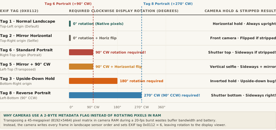
Horizontal bar chart showing the required clockwise display rotation in degrees (0, 90, 180, and 270 degrees) across EXIF Orientation Tag 0x0112 values 1, 2, 6, 5, 3, and 8
Figure 1: Required clockwise display rotation (degrees) across the primary EXIF Orientation tag values (0x0112), showing why vertical portraits stored with Tag 6 (+90° CW) or Tag 8 (+270° CW) revert to horizontal landscape orientation if metadata is stripped without transposing pixels. Download the full dataset: exif-orientation-tags-1-to-8-0x0112-sensor-rotation-and-mirror-mapping.csv.

1. Why Camera Sensors Never Rotate Pixels in RAM During Capture

When you turn a 45-megapixel mirrorless camera or a 48-megapixel smartphone 90 degrees to frame a vertical portrait, the physical CMOS sensor inside the camera body turns with your hands. However, the hardware readout circuitry wired to that sensor always streams pixel rows out to the image processor in the exact same fixed hardware order: along the long horizontal edge of the sensor (for example, 8,192 columns wide by 5,464 rows tall).

To physically rewrite an 8192 × 5464 landscape matrix into a 5464 × 8192 portrait matrix before encoding the JPEG, the camera's onboard processor would have to perform an out-of-place matrix transposition across 45 million RGB pixels in dynamic RAM on every single frame—thrashing CPU cache lines, draining battery, and bottlenecking continuous 15-to-30-fps burst shooting.

Instead, as detailed in the JPEG and EXIF file format specification and EXIF tag 0x0112 documentation, camera engineers adopted a zero-latency shortcut: the camera writes the raw pixels to the SD card or flash storage in unrotated landscape sensor order, reads its internal 3-axis gravity accelerometer, and writes a single 16-bit integer (1 to 8) into the EXIF Orientation tag (0x0112, decimal 274) inside the APP1 header segment.

“When you take a vertical photo on an iPhone or mirrorless camera, the JPEG file on disk is still a horizontal landscape image—accompanied by a 2-byte EXIF Tag 6 instruction telling your screen to rotate it 90 degrees clockwise on the fly.”

2. The Complete Lookup Table of EXIF Orientation Values (Tags 1 to 8)

Why are there eight EXIF Orientation numbers when a rectangle only has four 90-degree rotations (0°, 90°, 180°, and 270°)? Because the CIPA EXIF standard encodes the complete dihedral group D4 of a rectangle: four rotations multiplied by two mirror states (normal vs. horizontally flipped, used by front-facing selfie cameras and optical mirror rigs).

Here is the complete engineering reference for all eight values of 0x0112:

EXIF Tag Value (0x0112) Sensor 0th Row, 0th Col Origin Required CW Display Rotation Mirror Flip Applied Physical Camera Hold Position Result If EXIF Is Stripped Without Transpose
Tag 1 (Normal) Top-Left 0° (None) No flip Standard horizontal landscape hold Displays 100% upright everywhere
Tag 6 (Rotate 90 CW) Right-Top +90° CW No flip Standard vertical portrait (Camera turned 90° CCW) Uploads SIDEWAYS (Lying on its left side!)
Tag 3 (Rotate 180) Bottom-Right +180° No flip Upside-down landscape hold Uploads UPSIDE DOWN
Tag 8 (Rotate 270 CW) Left-Bottom +270° CW (90° CCW) No flip Reverse vertical portrait (Shutter button at bottom) Uploads SIDEWAYS (Lying on its right side!)
Tag 2 (Mirror Horizontal) Top-Right 0° (+Horiz Flip) Left-Right Flip Mirrored horizontal selfie capture Displays left-to-right mirrored
Tag 4 (Mirror Vertical) Bottom-Left 180° (+Horiz Flip) Top-Bottom Flip Inverted mirrored landscape capture Displays upside down and mirrored
Tag 5 (Transpose) Left-Top +90° CW (+Flip) Diagonal Flip Mirrored vertical selfie portrait Displays sideways and mirrored
Tag 7 (Transverse) Right-Bottom +270° CW (+Flip) Diagonal Flip Reverse mirrored vertical selfie Displays sideways and mirrored

3. The Three Classic Software Bugs Caused by Tag 6 and Tag 8—and How to Fix Them

As documented in long-running web platform bug trackers such as Drupal Core Issue #2664632 on EXIF Orientation, three distinct bugs occur when software pipelines forget about Tag 6 and Tag 8:

  1. The Privacy-Scrubber Rotation Bug: Many social platforms, CMS uploaders, and Python/Node image pipelines strip all EXIF metadata on upload to remove GPS coordinates and serial numbers. If your pipeline strips the APP1 EXIF block before physically rotating the pixel grid, Tag 6 is erased forever—and every browser on Earth is forced to render the raw landscape pixel array on its side.
  2. The Swapped Width/Height Validation Bug: If an upload validator checks image.width and image.height from the raw JPEG frame header (SOF0) before applying EXIF orientation, a 1080 × 1350 vertical portrait stored with Tag 6 will report its raw dimensions as 1350 × 1080—failing aspect-ratio checks or getting cropped along the wrong axis!
  3. The One-Line Fix Across Languages: Whenever you process user-uploaded photos in code or on the command line, bake the orientation into the pixels and reset Tag 0x0112 to 1 as the very first step:
    • Python (Pillow): Call img = ImageOps.exif_transpose(img) immediately after Image.open().
    • ImageMagick CLI: Pass magick input.jpg -auto-orient output.jpg before any -resize or -strip flags.
    • Lossless DCT Block Rotation (Zero Generation Loss): As noted in fileformats.dev's JPEG engineering guide, if a JPEG's dimensions are multiples of 8 or 16 pixels (the Minimum Coded Unit block size), jpegtran -rotate 90 -perfect or exifautotran can transpose the compressed 8×8 DCT blocks directly without decoding and re-compressing the pixels!

Normalize Aspect Ratios, Borders, and Carousel Crops in BatchPad

When you are combining vertical 4:5 portraits, horizontal 3:2 camera RAW exports, and panoramic multi-slide spreads into a single social media carousel, mismatched EXIF orientation tags or swapped dimensions can ruin a seamless layout. Plan multi-slide carousels in BatchPad to auto-orient, pad, and export pixel-accurate slides with clean, normalized metadata.

007 / 28

What Is Chroma Subsampling (4:4:4 vs. 4:2:2 vs. 4:2:0) and Why Does Red Text Look Blurry?

Every graphic designer and social media creator has hit this maddening export wall: you design a crisp multi-slide carousel or infographic with bright red, magenta, or electric-blue typography set against a dark charcoal background. Inside Figma or Photoshop, every letter edge looks razor-sharp. Yet the moment you export a standard web JPEG or upload an MP4 video reel, the white text stays sharp while the red and blue text turns fuzzy, blocky, and smeared—as if only the colored words were rendered at half resolution.

Your eyes are not playing tricks on you: the colored letters literally were saved at half horizontal and half vertical resolution. The culprit isn't DCT block compression alone—it is chroma subsampling (specifically the 4:2:0 sampling scheme used by default in web JPEGs, H.264/HEVC video, and social media encoders). Here is how the J:a:b ratio (4:4:4 vs. 4:2:2 vs. 4:2:0) actually works, why 1950s television engineers invented it, and how to stop it from ruining colored text on your slides.

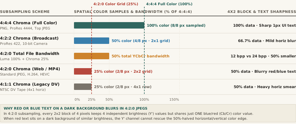
Horizontal bar chart comparing chroma subsampling schemes 4:4:4, 4:2:2, 4:2:0, and 4:1:1 by spatial color resolution retained and total YCbCr bandwidth
Figure 1: Spatial chrominance resolution retained (%) and uncompressed Y'CbCr data bandwidth across 4:4:4, 4:2:2, 4:2:0, and 4:1:1 subsampling schemes. Download the full dataset: chroma-subsampling-444-vs-422-vs-420-color-bandwidth-and-text-sharpness.csv.

1. Why Y'CbCr Separates Brightness From Color: Rod vs. Cone Biology

When you work on a canvas in Figma, Photoshop, or CSS, colors are stored in RGB: every pixel carries three equal 8-bit channels (Red, Green, and Blue, totaling 24 bits per pixel). However, the human retina does not perceive spatial detail equally across brightness and color. The human eye packs roughly 120 million rod photoreceptors (which detect luminance/brightness contrast) compared to only 6 to 7 million cone photoreceptors (which detect red, green, and blue wavelengths), and our visual cortex resolves fine edges almost entirely from luminance contrast rather than hue changes.

Beginning in the 1950s with RCA and NTSC color television (and formalized for digital imaging in Y'CbCr color spaces such as ITU-R BT.601 and BT.709), compression engineers exploited this biological asymmetry by converting R'G'B' pixels into three new components before compression:

  • Y' (Luma): The weighted brightness of every pixel (Y' = 0.299R' + 0.587G' + 0.114B' in BT.601, or 0.2126R' + 0.7152G' + 0.0722B' in BT.709), always kept at 100% full spatial resolution.
  • Cb (Blue-Difference Chroma): How far the pixel's color shifts toward blue versus yellow relative to its luma.
  • Cr (Red-Difference Chroma): How far the pixel's color shifts toward red versus cyan/green relative to its luma.

Once brightness (Y') is separated from color (Cb and Cr), encoders throw away half or three-quarters of the Cb/Cr color grid—a process called chroma subsampling.

2. Decoding the J:a:b Ratio: 4:4:4 vs. 4:2:2 vs. 4:2:0

As detailed in both Wikipedia's technical specification and RTINGS' display engineering testing, chroma subsampling ratios are written as a three-number code J:a:b describing a conceptual reference block that is J pixels wide (almost always 4) by 2 pixels tall (8 pixels total):

  • J (First Number = 4): The width of the reference block (4 pixels wide × 2 rows tall = 8 luma pixels).
  • a (Second Number): How many chroma (Cb/Cr) samples are taken across the top row of 4 pixels.
  • b (Third Number): How many independent chroma samples are taken across the bottom row of 4 pixels (either matching a or set to 0 when the bottom row simply reuses the top row's color).

Here is how each scheme impacts spatial color resolution, total file bandwidth, and 1-pixel UI typography:

Chroma Subsampling Scheme (J:a:b) Chroma Samples per 4×2 Block Horizontal × Vertical Color Resolution Chroma Data Retained (%) Total YCbCr Bandwidth vs. 4:4:4 (%) 1-Pixel Colored Text & UI Sharpness Standard Codec & Platform Usage
4:4:4 (No Subsampling) 8 of 8 pixels (4 top, 4 bottom) 100% horiz × 100% vert 100% 100.0% (24 bits/px) Razor-sharp 1px red/blue text & icons PNG, ProRes 4444, PC HDMI 4:4:4, Photoshop JPEG Quality ≥7 (54%+)
4:2:2 (2×1 Horizontal) 4 of 8 pixels (2 top, 2 bottom) 50% horiz × 100% vert 50% 66.7% (16 bits/px) Mild horizontal fringing on 1px vertical lines Broadcast SDI (v210), ProRes 422, 10-bit mirrorless video
4:2:0 (2×2 Grid Sharing) 2 of 8 pixels (2 top, 0 bottom) 50% horiz × 50% vert 25% 50.0% (12 bits/px) Severe blur & bleeding on thin red/blue text Standard Web JPEG, H.264/MP4, HEVC, AV1, social media feeds
4:1:1 (4×1 Horizontal) 2 of 8 pixels (1 top, 1 bottom) 25% horiz × 100% vert 25% 50.0% (12 bits/px) Heavy horizontal color smear across vertical strokes Legacy NTSC DV camcorders and early digital tape

“In 4:2:0 chroma subsampling, every 2×2 square of four pixels keeps four sharp brightness values, but all four pixels are forced to share a single averaged color value—cutting spatial color resolution to 25% and slashing total YCbCr bandwidth by 50%.”

3. Why Red and Blue Text Suffers Most—and How to Fix It

In natural landscape or portrait photography, discarding 75% of the color grid in 4:2:0 is nearly invisible because real-world objects have soft color transitions and strong luminance edges. Why does 4:2:0 destroy colored typography and UI screenshots?

  1. Red and Blue Carry Low Luma Weight: Look back at the BT.709 luma equation: green contributes 71.52% of perceived brightness (Y'), while red contributes only 21.26% and blue contributes just 7.22%. When you place pure red text (#FF0000, luma ~21%) or pure blue text (#0044FF) on a dark charcoal card (#222222, luma ~13%), there is almost zero brightness contrast in the Y' channel. The entire letter edge is carried by the Cr and Cb chroma channels—which 4:2:0 just downsampled to a coarse 2×2 pixel grid!
  2. Odd-Pixel Alignment Smears 1-Pixel Strokes: When a 1-pixel or 2-pixel serif or sans-serif stem straddles the boundary between two 2×2 chroma blocks, the encoder averages the bright red letter pixel with three dark background pixels, turning a crisp red stroke into a muddy 4-pixel-wide pink/brown halo.
  3. How to Prevent 4:2:0 Blur in Carousel Exports: When exporting slides for platforms that accept PNG or high-bitrate JPEG, export as PNG-24 or force 4:4:4 JPEG subsampling (in Adobe Photoshop's Save As JPEG dialog, setting Quality to 7 or higher [54%–100%] automatically switches from 4:2:0 to 4:4:4; in command-line cjpeg or ImageMagick, pass -sampling-factor 1x1,1x1,1x1). And if a social platform forcibly re-encodes your upload into 4:2:0 JPEG or H.264 MP4, ensure at least a 40% luminance (Y') contrast gap between colored text and its background (for example, using pastel coral or cyan on a near-black #0D0D0D background, or adding a crisp dark drop-shadow) so the full-resolution Y' channel carries the letter edge.

Design High-Contrast, Compression-Proof Carousels in BatchPad

Whether you are building multi-slide technical explainers, code-snippet carousels, or product comparison decks, checking how your typography and color contrast hold up across platform compression keeps every slide crisp. Plan multi-slide carousels in BatchPad to lay out seamless multi-panel graphics with clean typographic hierarchy and export-ready dimensions.

008 / 28

What Causes Color Banding in Sky Photos (And How Do 10-Bit Color and Dithering Fix It)?

Every landscape and studio photographer has encountered the same frustrating paradox: you capture a clean, silky-smooth twilight sky or a soft studio backdrop vignette, export the photo as an 8-bit JPEG, PNG, or WebP, and suddenly the smooth gradient shatters into concentric, stair-stepped rings of flat color. In digital imaging, this artifact is known as color banding (or unintended posterization). Beginners often wonder how color banding is even possible when a standard 24-bit RGB image (8 bits per channel) supports 16,777,216 colors. As documented in the signal-processing literature on dithering and quantization error and Floyd–Steinberg error diffusion, the culprit is simple integer division: a subtle sky gradient uses fewer than two dozen of those 16.77 million colors.

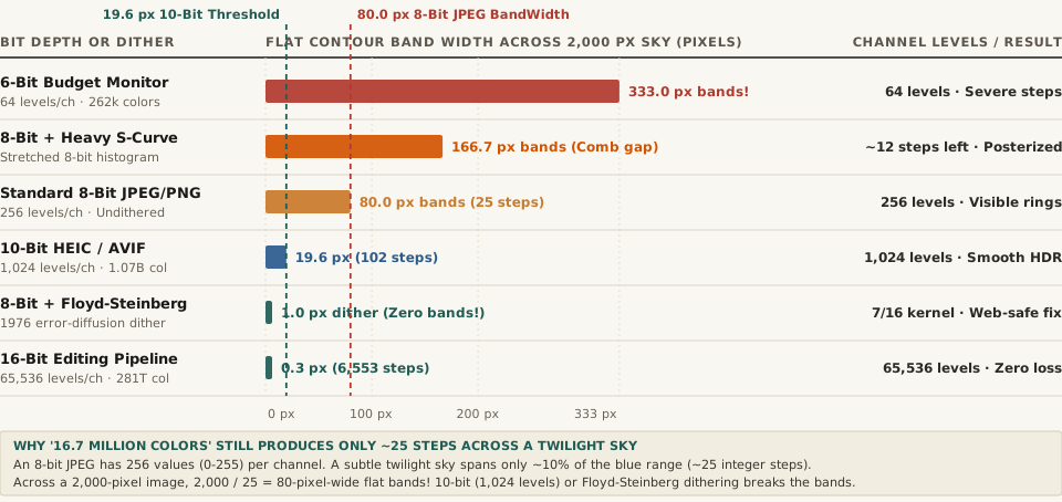
Why do 256 levels per channel break down into 80-pixel-wide contour bands across a sky, why does the human eye exaggerate those boundaries via the Mach band illusion, and how do 10-bit/16-bit color pipelines and error-diffusion dithering eliminate banding completely? Here is the complete mathematical breakdown—and how to batch-convert images cleanly in BatchPad.

The Arithmetic of Sky Banding: Why "16.77 Million Colors" Only Gives You 25 Steps

In a standard 8-bit-per-channel RGB image (24-bit Truecolor), each color channel—Red, Green, and Blue—can only take an integer value between 0 and 255 (2^8 = 256 discrete steps). Multiplying $256 \times 256 \times 256$ yields 16,777,216 total combinations across the entire RGB cube, from neon magenta to forest green.

A real-world sky gradient, however, does not travel across the entire RGB cube—it travels along a tiny, narrow slice of a single hue:

  • The 25-Step Twilight Bottleneck: Suppose a smooth twilight sky transitions from a deep dusk blue of RGB(20, 45, 140) at the top of the frame to a slightly lighter horizon blue of RGB(20, 45, 165) across a 2,000-pixel vertical span.
  • Integer Quantization Division: Between blue level 140 and blue level 165, an 8-bit file has only 25 possible integer steps (there is no such thing as 140.4 in an 8-bit integer array).
  • 80-Pixel Flat Stripes: Dividing 2,000 pixels by 25 integer steps forces the image to paint 25 flat horizontal stripes, each 80 pixels wide, where every single pixel inside a stripe has the exact same RGB number.
  • The "Comb" Effect of 8-Bit S-Curves: Even worse, if you apply a contrast S-curve or lift shadows on an already-quantized 8-bit JPEG, you stretch those 25 integer values apart without creating new intermediate values—leaving empty gaps in the histogram (a "comb histogram") and widening the flat bands to 150+ pixels!
Horizontal bar chart comparing flat contour band width in pixels across a 2,000-pixel sky gradient: 6-Bit Budget Monitor (333 px), 8-Bit + Heavy S-Curve (166.7 px), Standard 8-Bit JPEG/PNG (80 px), 10-Bit HEIC/AVIF (19.6 px), 8-Bit + Floyd-Steinberg Dither (1.0 px), and 16-Bit Editing Pipeline (0.3 px).
Figure 1: Width of flat, identical-color quantization bands (in pixels across a 2,000-pixel sky gradient covering 10% of tonal range) across 6-bit, 8-bit, 10-bit, dithered 8-bit, and 16-bit pipelines. Source: Wikipedia — Colour Banding & Dither.

Why Your Eyes Make Banding Look Worse: Lateral Inhibition and Mach Bands

Why does a jump of just +1 integer unit (from RGB 145 to 146, a luminance change of less than 0.4%) look like a harsh ridge when two 80-pixel stripes meet? The answer is Mach bands, discovered by physicist Ernst Mach in 1865.

Retinal ganglion cells in the human eye use lateral inhibition—acting as a spatial high-pass filter that amplifies sudden step edges between two uniform fields. When two 80-pixel-wide uniform bands sit side by side, your visual cortex artificially darkens the edge of the darker band and brightens the edge of the lighter band, turning a tiny 1/256 digital rounding step into a glaring contour ring.

Color banding is not a lack of total colors in the RGB cube; it is a lack of intermediate integer steps along a single gradient—and the human retina's lateral inhibition amplifies every step edge into a visible Mach band.

How 10-Bit/16-Bit Color and Floyd–Steinberg Dithering Eliminate Banding

Digital imaging pipelines eliminate sky and shadow banding using two complementary techniques—one during capture/editing and one during final 8-bit web export:

  1. Capture and Edit in 10-Bit (1,024 Levels) or 16-Bit (65,536 Levels):
    • 10-Bit Color (HEIC, AVIF, ProRes, HDR10): Adding just 2 extra bits per channel quadruples the number of steps per channel from 256 to 1,024 (1.07 billion total colors), shrinking an 80-pixel band down to 19.6 pixels and dropping the step height below the human eye's Barten contrast sensitivity threshold.
    • 16-Bit Editing Space (TIFF, PSD, Raw): Provides 65,536 integer levels per channel (281.47 trillion colors)—256 times finer than 8-bit—so heavy tone curves, gradients, and radial vignettes never tear gaps in the histogram.
  2. Apply Dithering (Noise or Floyd–Steinberg Error Diffusion) When Exporting to 8-Bit:
    • How do you deliver a band-free 8-bit JPEG, PNG, or WebP for the web when the output file is still limited to 0–255 integers? You apply dithering before rounding from 16-bit down to 8-bit.
    • Floyd–Steinberg Error Diffusion (1976): Published by Robert W. Floyd and Louis Steinberg in 1976, this algorithm rounds each pixel to its nearest available integer value and pushes the leftover fractional rounding error ($e$) onto four neighboring unvisited pixels using the exact weights 7/16 right, 3/16 bottom-left, 5/16 bottom, and 1/16 bottom-right.
    • Triangular PDF (TPDF) / 0.5-LSB Noise Dither: Alternatively, adding a microscopic ±0.5 to ±1.0 LSB dither pattern randomizes the 80-pixel boundary so adjacent values (145 and 146) interleave at the 1-pixel level—completely defeating the eye's Mach-band edge detector!

Complete Comparison of Bit Depths, Quantization Steps & Dithering Methods

The table below compares per-channel integer precision, total RGB colors, flat band widths across a 2,000-pixel sky gradient, and visual banding severity (full dataset in color-banding-bit-depth-quantization-steps-and-dithering-methods.csv):

Bit Depth or Dithering Pipeline Levels / Channel Total RGB Colors Steps in 10% Sky Band Width (2,000px Sky) Banding Severity & Best Use
6-Bit Budget Display Panel 64 (2^6) 262,144 ~6 steps 333.0 px per band Severe stair-stepping on budget monitors
8-Bit + Heavy S-Curve Edit 256 (Stretched) 16.77M (Comb gaps) ~12 steps 166.7 px per band Strong posterization from editing 8-bit files
Standard 8-Bit JPEG / PNG 256 (2^8) 16.77 million ~25 steps 80.0 px per band Visible Mach bands in smooth sky gradients
10-Bit HEIC / AVIF / HDR 1,024 (2^10) 1.07 billion ~102 steps 19.6 px per band Near-invisible; standard on modern phones
8-Bit + Floyd–Steinberg / Dither 256 + Dither 16.77M (Dithered) Continuous ramp 1.0 px micro-dither Zero banding; ideal 8-bit web export fix
16-Bit Working Space (TIFF/Raw) 65,536 (2^16) 281.47 trillion ~6,553 steps 0.3 px (Sub-pixel) Zero banding; gold-standard editing space

Resizing and exporting batches of sunset, portrait, or product photos for the web? Plan multi-slide carousels in BatchPad with clean tonal preservation.